13.10 Models with Multiple Quantitative Predictors
We have used the General Linear Model approach in models with one categorical predictor and one quantitative predictor, and with models that have two categorical predictors. Let’s add one more type of model to the mix, one with two quantitative predictor variables.
Example: Lung Capacity in Young People
Here is a snippet of a data frame called fevdata collected by medical researchers interested in children’s lung function. They used a measure of lung capacity called forced expiratory volume (FEV), which is the amount of air an individual can exhale in the first second of a forceful breath (in liters). They collected this data from a sample of 654 young people ages 3-19. FEV is often used as a measure of lung capacity and pulmonary health.
head(select(fevdata, FEV, HEIGHT, AGE)) FEV HEIGHT AGE
1 1.708 57.0 9
2 1.724 67.5 8
3 1.720 54.5 7
4 1.558 53.0 9
5 1.895 57.0 9
6 2.336 61.0 8In addition to FEV, we’ve shown two other variables here: HEIGHT (measured in inches) and AGE (measured in years). Normal people know that as children get older (in this age range) they tend to get taller, and researchers have found that both being older and being taller are associated with increased FEV.
We can write this relationship between FEV, height and age with a word equation like this: FEV = HEIGHT + AGE + error.
Visualizing the Relationships Between FEV, HEIGHT and AGE
We can visualize relationships with categorical predictors in a number of ways. When we only have quantitative predictors, however, we are mostly limited to scatter plots and jitter plots.
Let’s start with a basic scatter plot of FEV predicted by height, and then add age to the plot using the argument color = ~AGE, which colors the dots based on age.
require(coursekata)

# delete when coursekata-r updated
fevdata <- read.table('http://jse.amstat.org/datasets/fev.dat.txt')
colnames(fevdata) <- c("AGE", "FEV", "HEIGHT", "SEX", "SMOKE")
fevdata <-  data.frame(fevdata)
# add the color argument to this scatter plot
gf_point(FEV ~ HEIGHT, data = fevdata)
gf_point(FEV ~ HEIGHT, data = fevdata, color = ~AGE)
# temporary SCT
ex() %>% check_error()
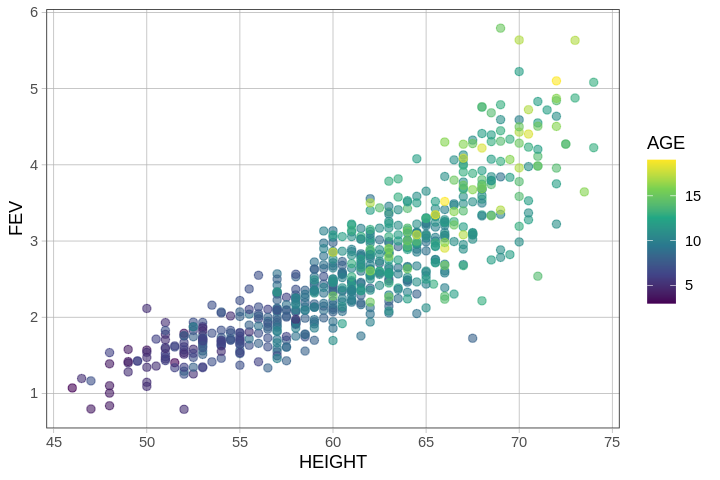
In this plot, each dot represents a young person. Taller people are represented by the dots on the right; older people are represented by lighter-colored dots (more yellow).
There is redundancy between the two explanatory variables HEIGHT and AGE such that older kids are taller. Using the concepts we developed earlier, we can use a multivariate model to figure out how much of the variation in FEV is uniquely related to HEIGHT and how much is uniquely related to AGE.
A Multivariate Model of FEV
Use the code window below to fit a model that uses both HEIGHT and AGE to predict FEV and output the best-fitting parameter estimates.
require(coursekata)

# delete when coursekata-r updated
fevdata <- read.table('http://jse.amstat.org/datasets/fev.dat.txt')
colnames(fevdata) <- c("AGE", "FEV", "HEIGHT", "SEX", "SMOKE")
fevdata <-  data.frame(fevdata)
# find the best fitting parameter estimates
lm(FEV ~ HEIGHT + AGE, data = fevdata)
# temporary SCT
ex() %>% check_error()Call:
lm(formula = FEV ~ HEIGHT + AGE, data = fevdata)
Coefficients:
(Intercept) HEIGHT AGE
-4.61047 0.10971 0.05428 The \(b_0\) estimate (-4.61) is the predicted lung function for someone who has a height of 0 and an age of 0. Of course, no one is 0 inches tall and no one is 0 years old, and a negative lung capacity is also not possible. A y-intercept is mathematically necessary for defining a straight line, but we should always be careful not to believe model predictions that go far beyond the reaches of our data!
The \(b_1\) estimate, for HEIGHT, is the predicted increase in FEV for each one-unit (i.e., one inch) increase in height, controlling for age.
Visualizing the Model Predictions
In an earlier model, PriceK ~ Neighborhood + HomeSizeK, we were able to represent the model predictions as two parallel lines, one for each neighborhood. This was possible because Neighborhood was a categorical variable with two levels.
In the current model, however, both HEIGHT and AGE are continuous variables. If we plot the model predictions for FEV ~ HEIGHT we would get a single straight line. But to add AGE into the model, we would need to plot many parallel lines, one for each possible age. This is a lot of lines, and it’s not easy to visualize.
One way we can visualize the FEV ~ HEIGHT + AGE model is to pick several ages, then plot the lines that use HEIGHT to predict FEV for each of these ages. The gf_model() function will, by default, plot three lines for age: one for the average age (around 10 years old in fevdata), another for the age 1 standard deviation below average, and the third for the age 1 standard deviation above average.
In the code window below, try chaining on gf_model() to the plot we made before.
require(coursekata)

# delete when coursekata-r updated
fevdata <- read.table('http://jse.amstat.org/datasets/fev.dat.txt')
colnames(fevdata) <- c("AGE", "FEV", "HEIGHT", "SEX", "SMOKE")
fevdata <-  data.frame(fevdata)
# this saves the multivariate model
multi_model <- lm(FEV ~ HEIGHT + AGE, data = fevdata)

# add the multi_model to this plot
gf_point(FEV ~ HEIGHT, data = fevdata, color = ~AGE, alpha = .2)
multi_model <- lm(FEV ~ HEIGHT + AGE, data = fevdata)

gf_point(FEV ~ HEIGHT, data = fevdata, color = ~AGE, alpha = .2) %>%
gf_model(multi_model)
# temporary SCT
ex() %>% check_error()
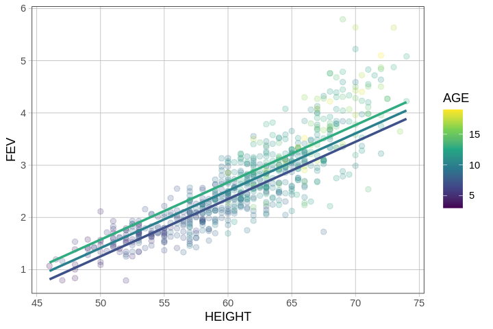
The fact that the lines for the different ages we have plotted are parallel is a feature of the model we have fit. In defining the model as additive (HEIGHT + AGE), we constrained the model to assume that the effect of HEIGHT is the same for every value of AGE (and also that the effect of AGE is the same for every HEIGHT). In the next chapter we will build interaction models in which this constraint is removed.
In this model, the fact that the lines are parallel indicates that, regardless of age, we add the same amount per inch of height to our prediction of FEV, which thus makes the slopes of the lines we have plotted the same. Similarly, regardless of height, the amount we add per additional year of age is the same.
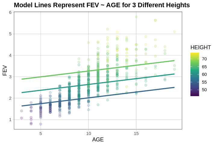
We can even use the same multi_model but just switch around the axes and colors on our graph.
multi_model <- lm(FEV ~ HEIGHT + AGE, data = fevdata)

gf_point(FEV ~ AGE, data = fevdata, color = ~HEIGHT, alpha = .2) %>%
gf_model(multi_model)
Visualizing the Model in Three Dimensions
Another way we can picture this data and model is by using 3 dimensions. In the gif below, we have plotted FEV, height, and age in a 3-dimensional scatter plot.
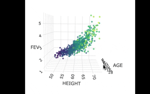
If we look at the model predictions (in the gif below), the many lines (each age’s line has the same color dots) actually make a flat surface – a plane!
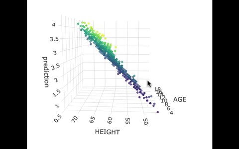
We’ve used a special R package called plotly to create these 3D visualizations. In the code window below, we have put in code for creating a 3D graph of the model predictions. If you run it, you’ll be able to move around the 3D visualization for yourself.
require(coursekata)

# delete when coursekata-r updated
fevdata <- read.table('http://jse.amstat.org/datasets/fev.dat.txt')
colnames(fevdata) <- c("AGE", "FEV", "HEIGHT", "SEX", "SMOKE")
fevdata <-  data.frame(fevdata)
# this loads plotly
library(plotly)

# this saves the predictions of the multivariate model
fevdata$prediction <- predict(lm(FEV ~ HEIGHT + AGE, data = fevdata))

# this makes the 3d plot of model
plot_ly(fevdata, x=~AGE, y=~HEIGHT, z=~prediction, type="scatter3d", mode="markers", color=~AGE, size = 1)
library(plotly)

# this saves the predictions of the multivariate model
fevdata$prediction <- predict(lm(FEV ~ HEIGHT + AGE, data = fevdata))

# this makes the 3d plot of model
plot_ly(fevdata, x=~AGE, y=~HEIGHT, z=~prediction, type="scatter3d", mode="markers", color=~AGE, size = 1)
# temporary SCT
ex() %>% check_error()