4.12 Fooled by Chance: The Problem of Type I Error
Let’s take a break from this praise-fest for the random assignment experiment, and talk about why we might still be fooled, even with the most powerful of all research designs.
Let’s say we did an ideal experiment, that everything was done very carefully and by the book. We randomly assigned tables of eaters in a restaurant to one of two groups. Tables in the experimental group got smiley faces on their checks; tables in the other group did not. Other than that, tables in both groups just went about their business normally. At the end of the experiment we measured the tips given by each table, and the tables in the smiley face group did, indeed, tip their servers a bit more money.
If this was a perfectly done experiment, there are two possible reasons why the smiley face group gave bigger tips. The first and most interesting possible reason is that there is a causal relationship between drawing a smiley face and tips! That would be cool if a little drawing really does make people tip more generously. But there is a second reason as well: random variation. It’s true that we randomly assigned tables to one of the groups. But even if we did not intervene, and no one got smiley faces, we would still expect some difference in tips across the two groups just by chance.
In a random assignment experiment, we know that any difference in an outcome variable between two groups prior to an intervention would be the result of random chance. But this does not mean that the difference between the two groups would be exactly 0, or that the two groups would have identical distributions on the outcome variable.
Let’s explore this idea further in a data frame called Tables. There are 44 restaurant tables in the data frame and two variables: TableID (just a number from 1 to 44 to identify each table) and Tip (in dollars, given by the table). Here are a few rows of this data frame.
head(Tables) TableID Tip
1 1 27
2 2 28
3 3 65
4 4 34
5 5 21
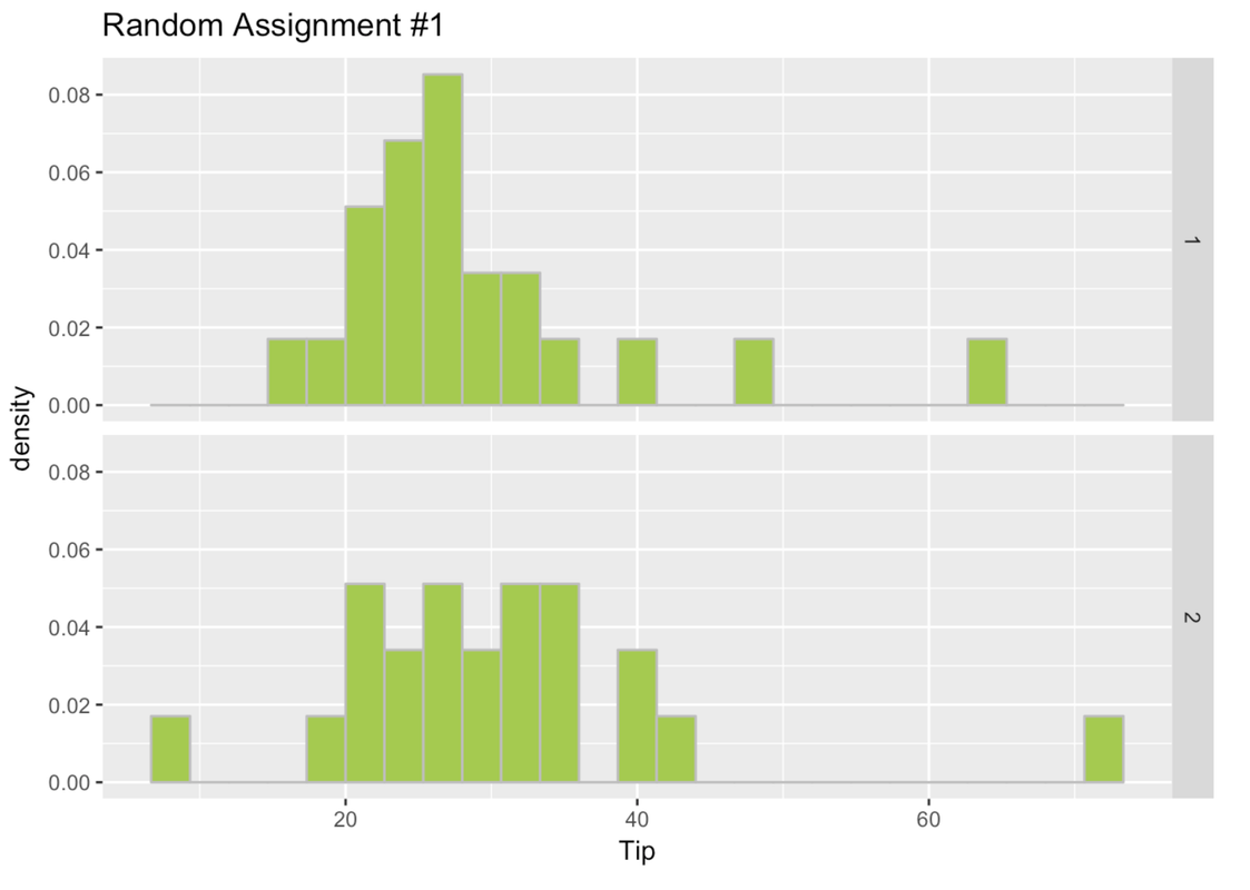
6 6 23In order to explore what the results would look like if the DGP were purely random, we can randomly assigned each of the 44 tables to Group 1 or 2. We saved their randomly assigned group number into a variable called random_groups_1. Here are a few rows of Tables showing this new variable.
head(Tables) TableID Tip random_groups_1
1 1 27 1
2 2 28 2
3 3 65 1
4 4 34 2
5 5 21 1
6 6 23 1Make histograms in a facet grid of Tip by the random_groups_1 variable from the data frame Tables.
require(coursekata)

Tables <- Servers %>% rename(TableID = ServerID)

set.seed(8)
Tables <- sample(Tables, orig.id=FALSE)
Tables$random_groups_1 <- append(rep(1,22), rep(2,22))
Tables$random_groups_1 <- factor(Tables$random_groups_1)
Tables <- arrange(Tables, TableID)
# Create density histograms in a facet grid of Tips by the random_groups_1 variable from Tables
gf_dhistogram(~Tip, data = Tables) %>% gf_facet_grid(random_groups_1 ~ .)
ex() %>% {
    check_function(., "gf_dhistogram") %>% {
        check_arg(., "object") %>% check_equal()
        check_arg(., "data") %>% check_equal()
    }
    check_function(., "gf_facet_grid") %>% check_arg("object") %>% check_equal()
}
We took these 44 tables and did the whole thing again, randomly assigning them to Group 1 or 2. We put the results in a new variable called random_groups_2. We used a function called shuffle() like this.
Tables$random_groups_2 <- shuffle(Tables$random_groups_1)Write the code to randomly assign these tables one more time and put the results in yet another variable called random_groups_3. Then print a few rows of the data frame Tables with these new random group assignments.
require(coursekata)
Tables <- rename(Servers, TableID = ServerID)

set.seed(8)
Tables <- sample(Tables, orig.id = FALSE)
Tables$random_groups_1 <- append(rep(1,22), rep(2,22))
Tables$random_groups_1 <- factor(Tables$random_groups_1)
Tables <- arrange(Tables, TableID)

set.seed(17)
Tables$random_groups_2 <- shuffle(Tables$random_groups_1)

set.seed(20)
# shuffle around random_groups_1 again to create new group assignments
Tables$random_groups_3 <-

# print a few lines of Tables
# shuffle around random_groups_1 again to create new group assignments
Tables$random_groups_3 <- shuffle(Tables$random_groups_1)

# print a few lines of Tables
head(Tables)
ex() %>% {
  check_object(., "Tables") %>%
    check_column("random_groups_3")

  check_or(.,
    check_function(., "shuffle") %>%
      check_arg("x") %>%
      check_equal(),
    override_solution_code(., "shuffle(Tables$random_groups_2)") %>%
      check_function(., "shuffle") %>%
      check_arg("x") %>%
      check_equal()
  )
} TableID Tip random_groups_1 random_groups_2 random_groups_3
1 1 27 1 2 1
2 2 28 2 2 1
3 3 65 1 2 1
4 4 34 2 1 2
5 5 21 1 1 2
6 6 23 1 2 2Go ahead and make Tip paneled by group histograms for random_groups_2 and random_groups_3.
require(coursekata)

Tables <- Servers %>% rename(TableID = ServerID)

set.seed(8)
Tables <- sample(Tables, orig.id=FALSE)
Tables$random_groups_1 <- append(rep(1,22), rep(2,22))
Tables$random_groups_1 <- factor(Tables$random_groups_1)
Tables <- arrange(Tables, TableID)

set.seed(17)
Tables$random_groups_2 <- shuffle(Tables$random_groups_1)

set.seed(20)
Tables$random_groups_3 <- shuffle(Tables$random_groups_1)
# create density histograms in a facet grid for random_groups_2

# create density histograms in a facet grid for random_groups_3
gf_dhistogram(~ Tip, data = Tables) %>% gf_facet_grid(random_groups_2 ~ .)
gf_dhistogram(~ Tip, data = Tables) %>% gf_facet_grid(random_groups_3 ~ .)
ex() %>% {
    check_function(., "gf_dhistogram", index = 1)
    check_function(., "gf_facet_grid", index = 1)
    check_function(., "gf_dhistogram", index = 2)
    check_function(., "gf_facet_grid", index = 2)
}
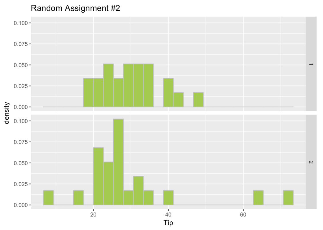
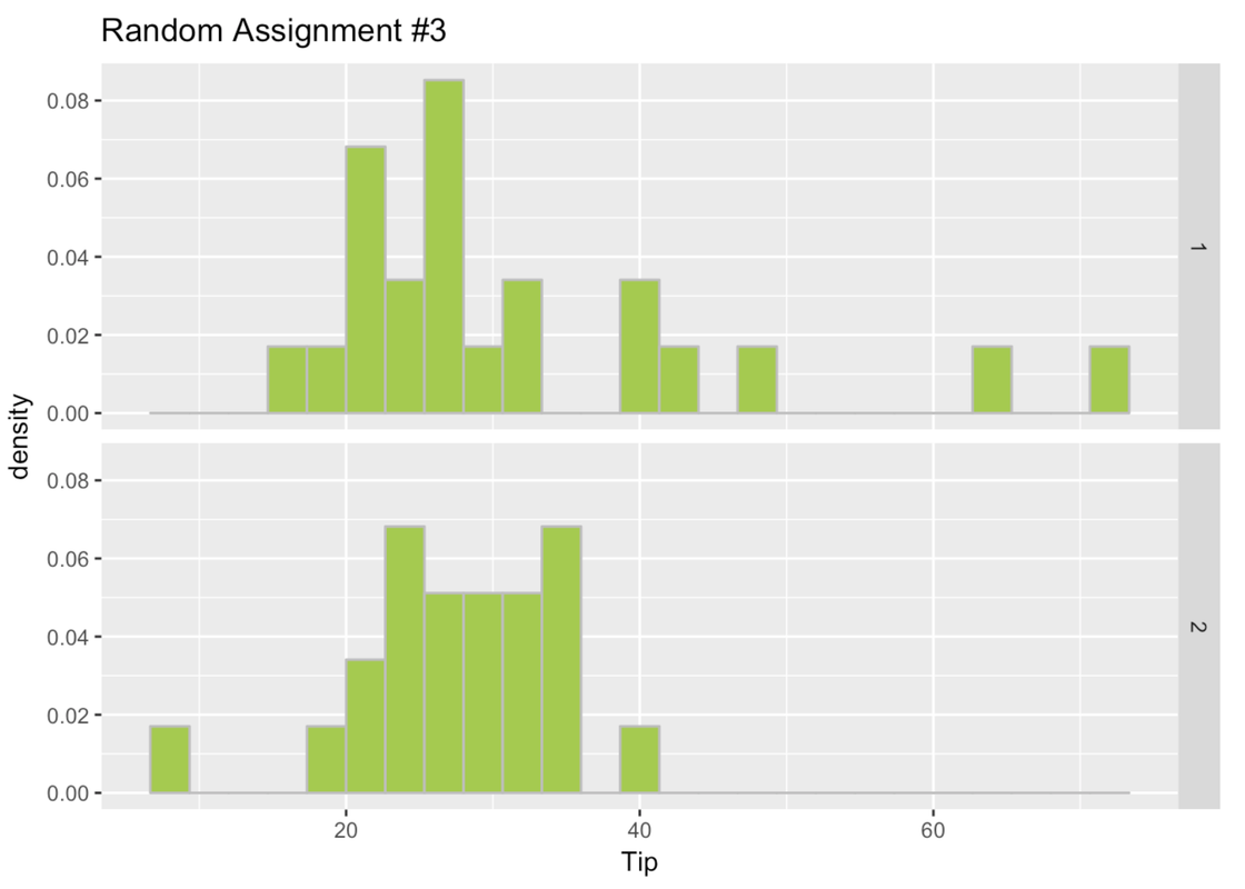
Here are the histograms for the three times we randomly assigned the tables to a group.
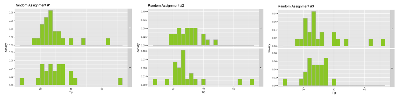
In this case, remember, these groups are different because of random chance! We randomly assigned them to these groups. There is nothing special about any of these groups. But even when there is nothing special about the groups, they look different from one another.
Sometimes the difference (which must, in this case, be due to chance) will appear large, as in the third set of histograms. In this case, we know that the difference is not due to the effect of some variable such as drawing a smiley face, because we haven’t done an experimental intervention at all. It must be due to chance.
The Real Tipping Experiment
In fact, some researchers actually did the experiment we have been describing and published the results in a 1996 paper. In the actual experiment, 44 restaurant tables were randomly assigned to either receive smiley faces on their checks or not. The tips you’ve been analyzing are the actual tipping data from their study.
The data from the real study included an additional variable, Condition (coded Smiley Face or Control), and are in a data frame called TipExperiment. Here are the first six rows of this data frame.
head(TipExperiment) TableID Tip Condition
1 1 39 Control
2 2 36 Control
3 3 34 Control
4 4 34 Control
5 5 33 Control
6 6 31 ControlIn the histogram below, we plotted the distribution of the outcome variable (Tip) for both conditions in TipExperiment.
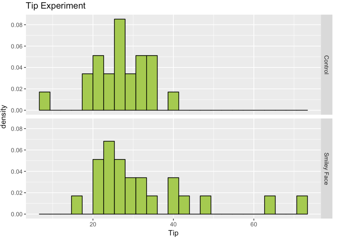
We observe some difference in the distributions across the groups. But keep in mind, we observed differences even when there had been no intervention! How do we know if this difference between experimental and control groups is a real effect of getting a smiley face and not just due to chance? How distinctive would the difference have to be to convince us that the smiley faces had an effect?
This decision is the root of what statisticians call Type I error. Type I error is when we conclude that some variable we manipulated—the smiley face in this case—had an effect, when in fact the observed difference was simply due to random sampling variation.
Later you will learn how to reduce the probability of making a Type I error. For now, just be aware of it. But spoiler alert: you can never reduce the chance of Type I error to zero; there is always some chance you might be fooled.