8.9 The Correlation Coefficient: Pearson’s r
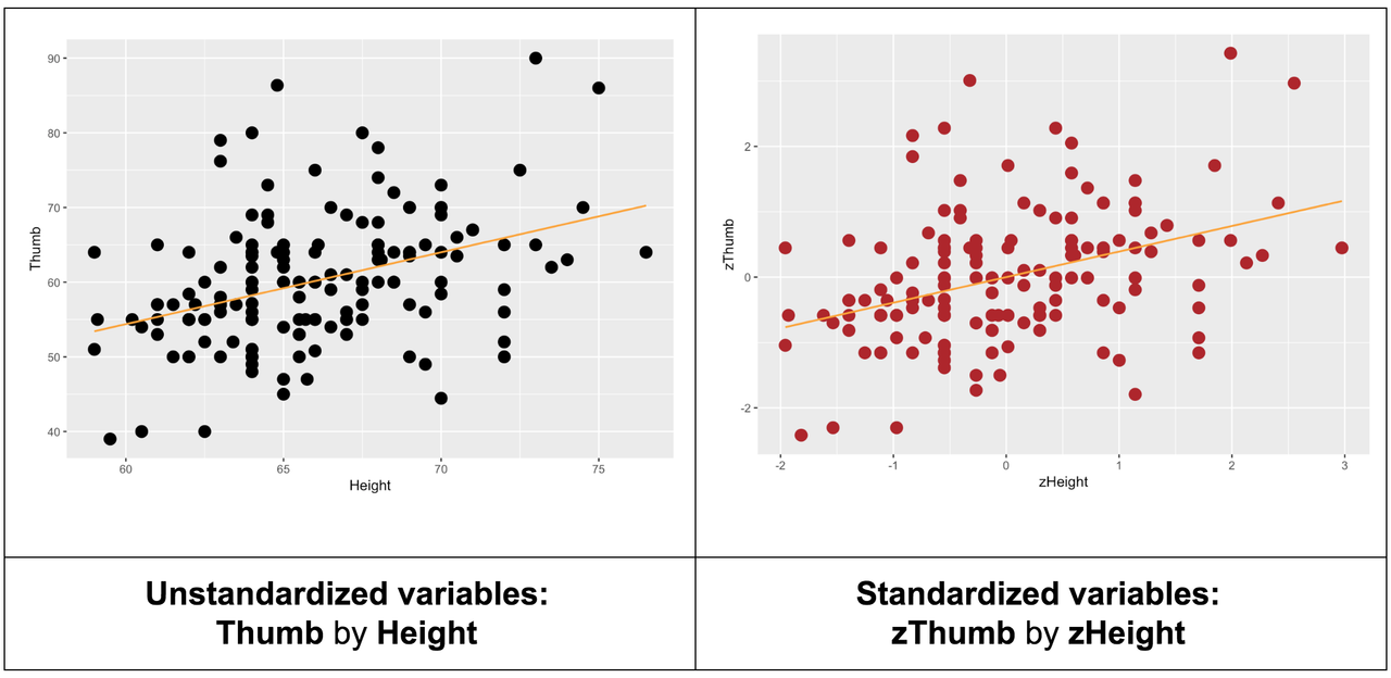
We originally introduced z scores as a way to compare scores across distributions measured in different units. Recall our comparison of Kargle and Spargle, two different games, with two different scoring systems. By transforming scores into z scores, we could easily compare scores across games by using standard deviations as the unit.
Transforming both outcome and explanatory variables serves a similar function in helping us assess the strength of a bivariate relationship between two quantitative variables independent of the units on which each variable is measured. The slope of the regression line between the standardized variables is called the correlation coefficient, or Pearson’s r.
We originally calculated Pearson’s r by transforming the variables into z scores and then fitting a regression line.
lm(zThumb ~ zHeight, data = Fingers)Call:
lm(formula = zThumb ~ zHeight, data = Fingers)
Coefficients:
(Intercept) zHeight
-1.801e-16 3.911e-01It seems like a lot of work to transform variables into z scores and then fit a regression line just to find out what the correlation coefficient is between two variables. Fortunately, R provides an easy way to directly calculate the correlation coefficient (Pearson’s r): the cor() function.
require(coursekata)

Fingers <- Fingers %>%
    filter(Thumb >= 33 & Thumb <= 100) %>%
    mutate(
        zThumb = zscore(Thumb),
        zHeight = zscore(Height)
    )
# this calculates the correlation of Thumb and Height
cor(Thumb ~ Height, data = Fingers)
cor(Thumb ~ Height, data = Fingers)
ex() %>% check_function("cor") %>% check_result() %>% check_equal()[1] 0.3910649When r = .39, the slope of the regression line when both variables are standardized is .39. This means that an observation that is one standard deviation above the mean on the explanatory variable (x-axis) is predicted to be .39 standard deviations above the mean on the outcome variable (y-axis).
Remember, the best-fitting regression model for Thumb by Height was \(Y_{i} = -3.33 + .96X_{i}\). The slope of .96 indicates an increment of .96 mm of Thumb length for every one inch increase in Height. We will call this slope the unstandardized slope (and we have been representing it as \(b_{1}\)).
While the slope of the standardized regression line is Pearson’s r, the slope of the unstandardized regression line is not directly related to r. However, there is a way to see the strength of the relationship in an unstandardized regression plot; it’s just not the slope!
In an unstandardized scatterplot we can “see” the strength of a bivariate relationship between two quantitative variables by looking at the closeness of the points to the regression line. Pearson’s r is directly related to how closely the points adhere to the regression line. If they cluster tightly, it indicates a strong relationship; if they don’t, it indicates a weak or nonexistent one.
Just as z scores let us compare scores from different distributions, the correlation coefficient gives us a way to compare the strength of a relationship between two variables with that of other relationships between pairs of variables measured in different units.
For example, compare the scatterplots below for Height predicting Thumb (on the left) and Pinkie predicting Thumb (on the right).
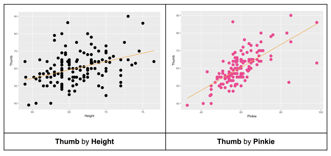
Correlation measures tightness of the data around the line—the strength of the linear relationship. Judging from the scatterplots, we would say that the relationship between Thumb and Pinkie is stronger because the linear Pinkie model would probably produce better predictions. Another way to say that is this: there is less error around the Pinkie regression line.
Try calculating Pearson’s r for each relationship. Are our intuitions confirmed by the correlation coefficients?
require(coursekata)

Fingers <- Fingers %>%
    filter(Thumb >= 33 & Thumb <= 100) %>%
    mutate(
        zThumb = zscore(Thumb),
        zHeight = zscore(Height)
    )
# this calculates the correlation of Thumb and Height
cor(Thumb ~ Height, data = Fingers)

# calculate the correlation of Thumb and Pinkie
# this calculates the correlation of Thumb and Height
cor(Thumb ~ Height, data = Fingers)

# calculate the correlation of Thumb and Pinkie
cor(Thumb ~ Pinkie, data = Fingers)
ex() %>% check_output_expr("cor(Thumb ~ Pinkie, data = Fingers)")[1] 0.3910649[1] 0.6755136The correlation coefficients confirm that pinkie finger length has a stronger relationship with thumb length than height. This makes sense because the points in the scatterplot of Thumb by Pinkie are more tightly clustered around the regression line than in the scatter of Thumb by Height.
Just as the slope of a regression line can be positive or negative, so can a correlation coefficient. Pearson’s r can range from +1 to -1. A correlation coefficient of +1 means that score of an observation on the outcome variable can be perfectly predicted by the observation’s score on the explanatory variable, and that the higher the score on one, the higher on the other.
A correlation coefficient of -1 means the outcome score is just as predictable, but in the opposite direction. With a negative correlation, the higher the score on the explanatory variable, the lower the score on the outcome variable.
Guess the Correlation
As you get more familiar with statistics you will be able to look at a scatterplot and guess the correlation between the two variables, without even knowing what the variables are! Here’s a game that lets you practice your guessing. Try it, and see what your best score is!
Note: After each guess, click on the <Guess> button—it will tell you what the true Pearson’s r is, and how far off your guess was. Click the box that says <Track Performance>, and see if you get better at guessing correlations.
Click here to play the game: (http://www.rossmanchance.com/applets/GuessCorrelation.html)
Practice until you are fairly confident in your ability. These are fun problems to include on exams!
Slope vs. Correlation
The unstandardized slope measures steepness of the best-fitting line. Correlation measures the strength of the linear relationship, which is indicated by how close the data points are to the regression line, regardless of slope. In the example scatterplots above, the correlations are the same, but the slopes are different.
Let’s think this through more carefully with the two scatterplots and best-fitting regression lines presented in the table below. For a brief moment, let’s give up on Thumb and try instead to predict the length of middle and pinkie fingers. On the left, we have tried to explain variation in Middle (outcome variable) with Pinkie (explanatory variable). On the right, we have simply reversed the two variables, explaining variation in Pinkie (outcome) with Middle (explanatory variable).
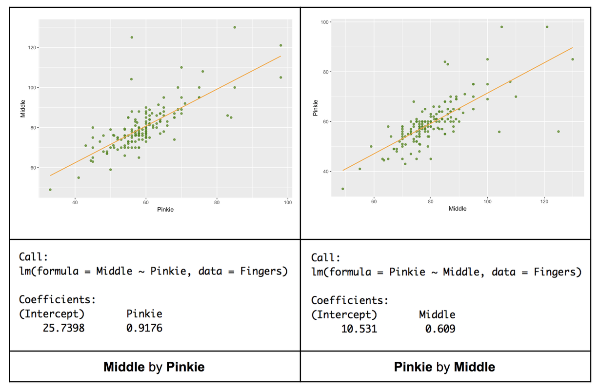
The slopes of these two lines are different. The one on the left is steeper, the one on the right more gradual in its ascent. And in fact, the slope of the line on the left is .92, compared to .61 on the right. Despite this difference, however, we know that the strength of the relationship, as is measured by Pearson’s r, is the same in both cases: they are the same two variables.
The slope difference in this case is due to the fact that middle fingers are a bit longer than pinkies. So, a millimeter difference in Pinkie, percentage wise, is a bigger deal than a millimeter difference in Middle. When the pinkie is a millimeter longer, the middle finger is .92 millimeters longer, on average; but when the middle finger is a millimeter longer, the pinkie is only up by .61 millimeters on average.
The unstandardized slope (the \(b_{1}\) coefficient) must always be interpreted in context. It will depend on the units of measurement of the two variables, as well as on the meaning that a change in each unit has in the scheme of things. There’s a lot going on in a slope! The advantage of unstandardized slopes is that they keep your theorizing grounded in context, and the predictions you make are in the actual units on which the outcome variable is measured.
However, the advantage of the standardized slope (Pearson’s r) is that it gives you a sense of the strength of the relationship. By the way, is Pearson’s r really the same in both the Middle by Pinkie and Pinkie by Middle situations? Try it out here.
require(coursekata)

Fingers <- Fingers %>%
    filter(Thumb >= 33 & Thumb <= 100) %>%
    mutate(
        zThumb = zscore(Thumb),
        zHeight = zscore(Height)
    )
# this calculates the correlation of Middle by Pinkie
cor(Middle ~ Pinkie, data = Fingers)

# this calculates the correlation of Pinkie by Middle
cor(Pinkie ~ Middle, data = Fingers)
# this calculates the correlation of Middle by Pinkie
cor(Middle ~ Pinkie, data = Fingers)

# this calculates the correlation of Pinkie by Middle
cor(Pinkie ~ Middle, data = Fingers)
ex() %>% {
    check_function(., "cor", index = 1) %>% check_result() %>% check_equal()
    check_function(., "cor", index = 2) %>% check_result() %>% check_equal()
}[1] 0.747588[1] 0.747588The standardized slope is the same because now the original units do not matter. Both variables are now in units of standard deviation. Correlations are an excellent way to gauge the strength of a relationship. But the tradeoff is this: predictions based on correlation are difficult to interpret (e.g., “a one SD increase in variable x produces a .75 SD increase in variable y”).
If you want to stay more grounded in your measures and what they actually mean, then the unstandardized regression slope is useful. Regression models give you predictions you can understand.
\(R^2\) and PRE
If you square Pearson’s r you end up with PRE!
For example, here is the supernova table for explaining variation in Thumb with Height.
Analysis of Variance Table (Type III SS)
Model: Thumb ~ Height

                               SS  df       MS      F    PRE     p
----- --------------- | --------- --- -------- ------ ------ -----
Model (error reduced) |  1816.862   1 1816.862 27.984 0.1529 .0000
Error (from model)    | 10063.349 155   64.925
----- --------------- | --------- --- -------- ------ ------ -----
Total (empty model)   | 11880.211 156   76.155
Try taking the correlation and squaring it in this code window. Will we get .1529?
require(coursekata)

Fingers <- Fingers %>%
    filter(Thumb >= 33 & Thumb <= 100) %>%
    mutate(
        zThumb = zscore(Thumb),
        zHeight = zscore(Height)
    )
# square this
cor(Thumb ~ Height, data = Fingers)
# square this
cor(Thumb ~ Height, data = Fingers) ^ 2
ex() %>% check_output_expr("cor(Thumb ~ Height, data = Fingers) ^ 2")[1] 0.1529318The result is exactly the PRE you got running supernova() on the Height model! It is the proportion of error reduced by the Height model compared to the empty model (SS Total).
Regression analyses will often report \(R^2\). \(R^2\) is just another name for PRE when the complex model is being compared to the empty model. (\(R^2\) won’t help you if in the future you want to compare one complex model to another complex model.)
And finally, remember that Pearson’s r is just a sample statistic—only an estimate of the true correlation in the population.