9.3 Exploring the Sampling Distribution of b1
It’s hard to look at a long list of \(b_1\)s and make any sense of them. But if we think of these numbers as a distribution – a sampling distribution – we can use the same tools of visualization and analysis here that we use to help us make sense of a distribution of data. For example, we can use a histogram to take a look at the sampling distribution of \(b_1\)s.
The code below will save the \(b_1\)s (estimates for \(\beta_1\)) for 1000 shuffles of the tipping study data into a data frame called sdob1, which is an acronym for sampling distribution of b1s. (We made up this name for the data frame just to help us remember what it is. You could make up your own name if you prefer.) Add some code to this window to take a look at the first 6 rows of the data frame, and then run the code.
require(coursekata)
sdob1 <- do(1000) * b1(shuffle(Tip) ~ Condition, data = TipExperiment)
sdob1 <- do(1000) * b1(shuffle(Tip) ~ Condition, data = TipExperiment)
head(sdob1)
# the instructions in the text above the exercise say that they can change the name of the object (sdob1) if they want
# just check the output of head to make sure it is correct
ex() %>%
    check_function("head") %>%
    check_result() %>%
check_equal() b1
1 -0.1363636
2 6.7727273
3 0.6818182
4 -0.5909091
5 -5.7727273
6 7.5000000In the window below, write an additional line of code to display the variation in b1 in a histogram.
require(coursekata)
# we created the sampling distribution of b1s for you
            sdob1 <- do(1000) * b1(shuffle(Tip) ~ Condition, data = TipExperiment)

            # visualize that distribution in a histogram
# we created the sampling distribution of b1s for you
sdob1 <- do(1000) * b1(shuffle(Tip) ~ Condition, data = TipExperiment)

# visualize that distribution in a histogram
gf_histogram(~b1, data = sdob1)
ex() %>% check_or(
            check_function(., "gf_histogram") %>% {
                check_arg(., "object") %>% check_equal()
                check_arg(., "data") %>% check_equal()
            },
            override_solution_code(., '{
                sdob1 <- do(1000) * b1(shuffle(Tip) ~ Condition, data = TipExperiment)
                gf_histogram(sdob1, ~b1)
            }') %>%
                check_function(., "gf_histogram") %>% {
                    check_arg(., "object") %>% check_equal()
                    check_arg(., "gformula") %>% check_equal()
                },
            override_solution_code(., '{
                sdob1 <- do(1000) * b1(shuffle(Tip) ~ Condition, data = TipExperiment)
                gf_histogram(~sdob1$b1)
            }') %>%
                check_function(., "gf_histogram") %>% {
                    check_arg(., "object") %>% check_equal()
                }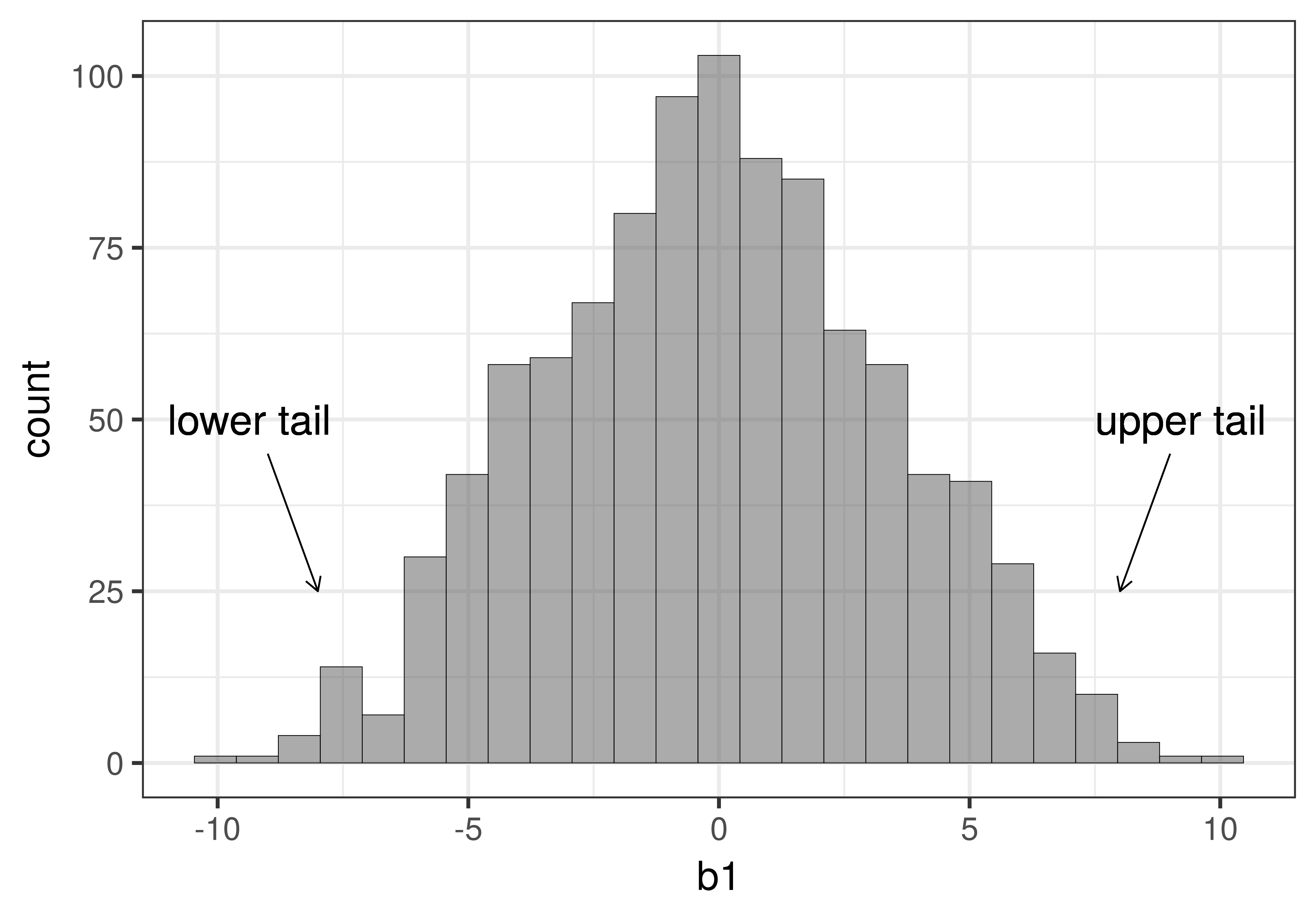
)Although this looks similar to other histograms you have seen in this book, it is not the same! This histogram visualizes the sampling distribution of \(b_1\)s for 1000 random shuffles of the tipping study data. There are a few things to notice about this histogram. The shape is somewhat normal (clustered in the middle and symmetric), the center seems to be around 0, and most of the values are between -10 and 10.
Because the sampling distribution is based on the empty model, where \(\beta_1=0\), we expect the parameter estimates to be clustered around 0. But we also expect them to vary because of sampling variation. Even if we generated a \(b_1\) as high as $10, it would just be the result of random sampling variation.
You can see from the histogram that while it’s not impossible to generate a \(b_1\) of 9 or 10, values such as 9 or 10 are much less frequent than values such as -1 or 1. In this case, the \(b_1\) represents a mean difference between the two conditions. Thus, another way to say this is that it’s easy to randomly generate small mean differences (e.g., -1 or 1) but harder to randomly generate large ones (e.g., -10 or 10).
Just eyeballing the histogram can give us a rough idea of the probability of getting a particular sample \(b_1\) from this DGP where we know \(\beta_1\) is equal to 0. When we use these frequencies to estimate probability, we are using this distribution of shuffled \(b_1\)s as a probability distribution.
Using the Sampling Distribution to Evaluate the Empty Model
We used R to simulate a world where the empty model is true in order to construct a sampling distribution. Now let’s return to our original goal, to see how this sampling distribution can be used to evaluate whether the empty model might explain the data we collected, or whether it should be rejected.
The basic idea is this: using the sampling distribution of possible sample \(b_1\)s that could have resulted from a DGP in which the empty model is true (i.e., in which \(\beta_1=0\)), we can look at the actual sample \(b_1\) and gauge how likely such a \(b_1\) would be if the empty model is, in fact, true.
If we judge the \(b_1\) we observed to be unlikely to have come from the empty model, we then would reject the empty model as our model of the DGP. If, on the other hand, we judge our observed \(b_1\) to be likely, then we would probably just stick with the empty model, at least until we have more evidence to suggest otherwise.
Let’s see how this works in the context of the tipping study, where \(b_1\) represents the average difference in tips between tables that got the hand-drawn smiley faces and those that did not.
Samples that are extreme in either a positive (e.g., average tips that are $8 higher in the smiley face group) or negative direction (e.g., -$8, representing much lower average tips in the smiley face group), are unlikely to be generated if the true \(\beta_1=0\). Both of these kinds of unlikely samples would make us doubt that the empty model had produced our data.
Put another way: if we had a sample that fell in either the extreme upper tail or extreme lower tail of the sampling distribution (see figure below), we might reject the empty model as the true model of the DGP.
In statistics, this is commonly referred to as a two-tailed test because whether our actual sample falls in the extreme upper tail or extreme lower tail of this sampling distribution, we would have reason to reject the empty model as the true model of the DGP. By rejecting the model in which \(\beta_1=0\), we would be deciding that some version of the complex model in which \(\beta_1\) is not equal to 0 must be true. We wouldn’t know exactly what the true \(\beta_1\) is, but only that it is probably not 0. In more traditional statistical terms, we would have found a statistically significant difference between the smiley face group and the control group.
Of course, even if we observe a \(b_1\) in one of the extreme tails and decide to reject the empty model, we could be wrong. Just by chance alone, some of the \(b_1\)s in the sampling distribution will end up in the tails even if the empty model is true in the DGP. Being fooled like this is what is called a Type I Error.
What Counts as Unlikely?
All of this, however, begs the question of how extreme a sample \(b_1\) would need to be in order for us to reject the empty model. What is unlikely to one person might not seem so unlikely to another person. It would help to have some sort of agreed upon standard of “what counts as unlikely” before we actually bring in our real sample statistic. The definition of “unlikely” depends on what you are trying to do with your statistical model and what your community of practice agrees on.
One common standard used in the social sciences is that a sample counts as unlikely if there is less than a .05 chance of generating one that extreme (in either the negative or positive direction) from a particular DGP. We notate this numerical definition of “unlikely” with the Greek letter \(\alpha\) (pronounced “alpha”). A scientist might describe this criterion by writing or saying that they “set alpha equal to .05”. If they wanted to use a stricter definition of unlikely, they might say “alpha equals .001,” indicating that a sample would have to be really unlikely for us to reject the empty model of the DGP.
Let’s try setting an alpha level of .05 to the sampling distribution of \(b_1\)s we generated from random shuffles of the tipping study data. If you take the 1000 \(b_1\)s and line them up in order, the .025 lowest values and the .025 highest values would be the most extreme 5% of values and therefore the most unlikely values to be randomly generated.
In a two-tailed test, we will reject the empty model of the DGP if the sample is not in the middle .95 of randomly generated \(b_1\)s. We can use a function called middle() to fill the middle .95 of \(b_1\)s in a different color.
gf_histogram(~b1, data = sdob1, fill = ~middle(b1, .95))The fill= part tells R that we want the bars of the histogram to be filled with particular colors. The ~ tells R that the fill color should be conditioned on whether the \(b_1\) being graphed falls in the middle .95 of the distribution or not.
Here’s what the histogram of the sampling distribution looks like when you add fill = ~middle(b1, .95) to gf_histogram().
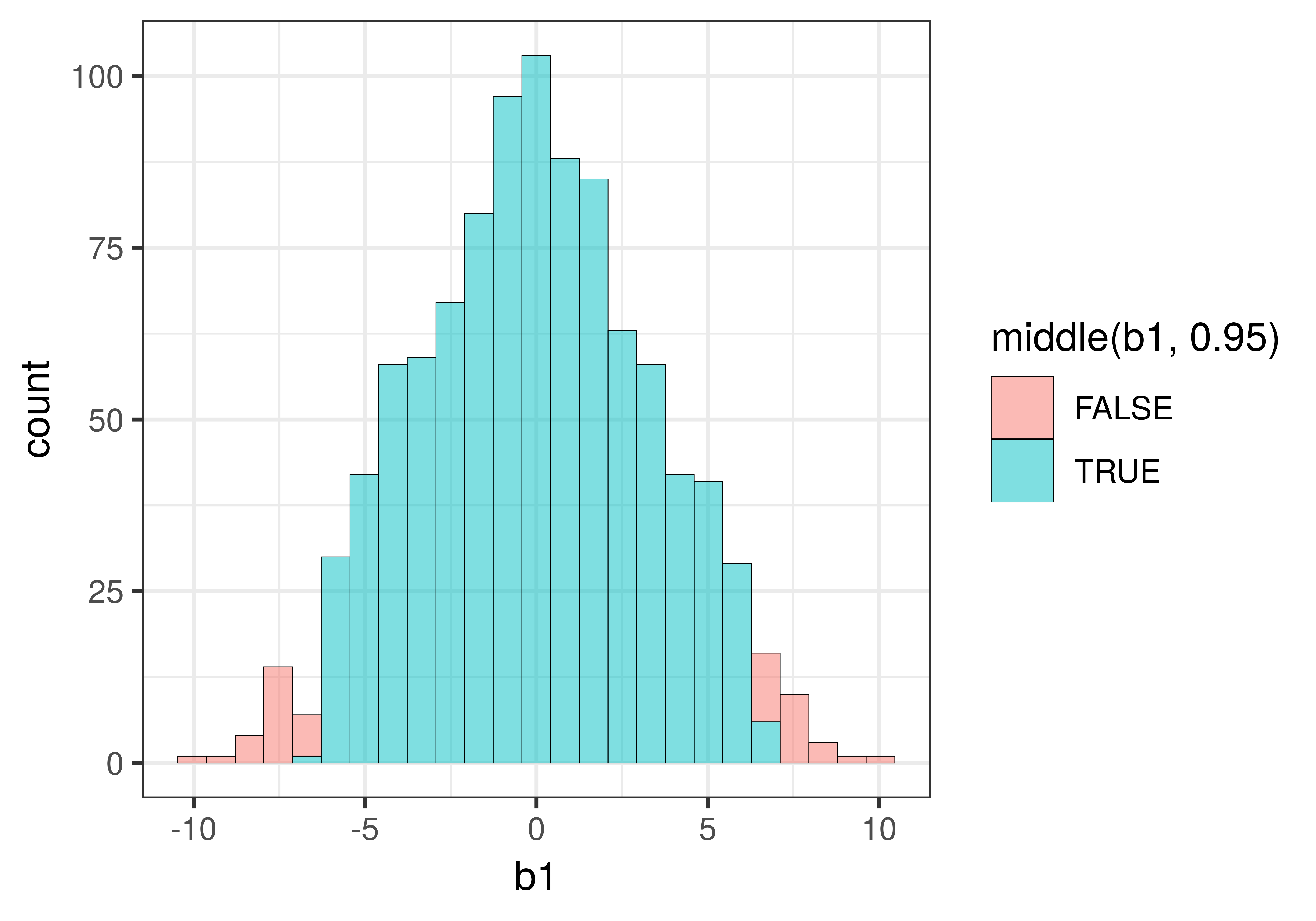
You might be wondering why some of the bars of the histogram include both red and blue. This is because the data in a histogram is grouped into bins. The value 6.59, for example, is grouped into the same bin as the value 6.68, but while 6.59 falls within the middle .95 (thus colored blue), 6.68 falls just outside the .025 cutoff for the upper tail (and thus is colored red).
If you would like to see a more sharp delineation, you could try making your bins smaller, or to put it another way, making more bins. Doing so would increase the chances of having just one color in each bin.
We re-made the histogram, but this time added the argument bins = 100 to the code (the default number of bins is 30). We also added show.legend = FALSE to get rid of the legend, and thus provide more space for the plot.
gf_histogram(~b1, data = sdob1, fill = ~middle(b1, .95), , bins = 100, show.legend = FALSE)
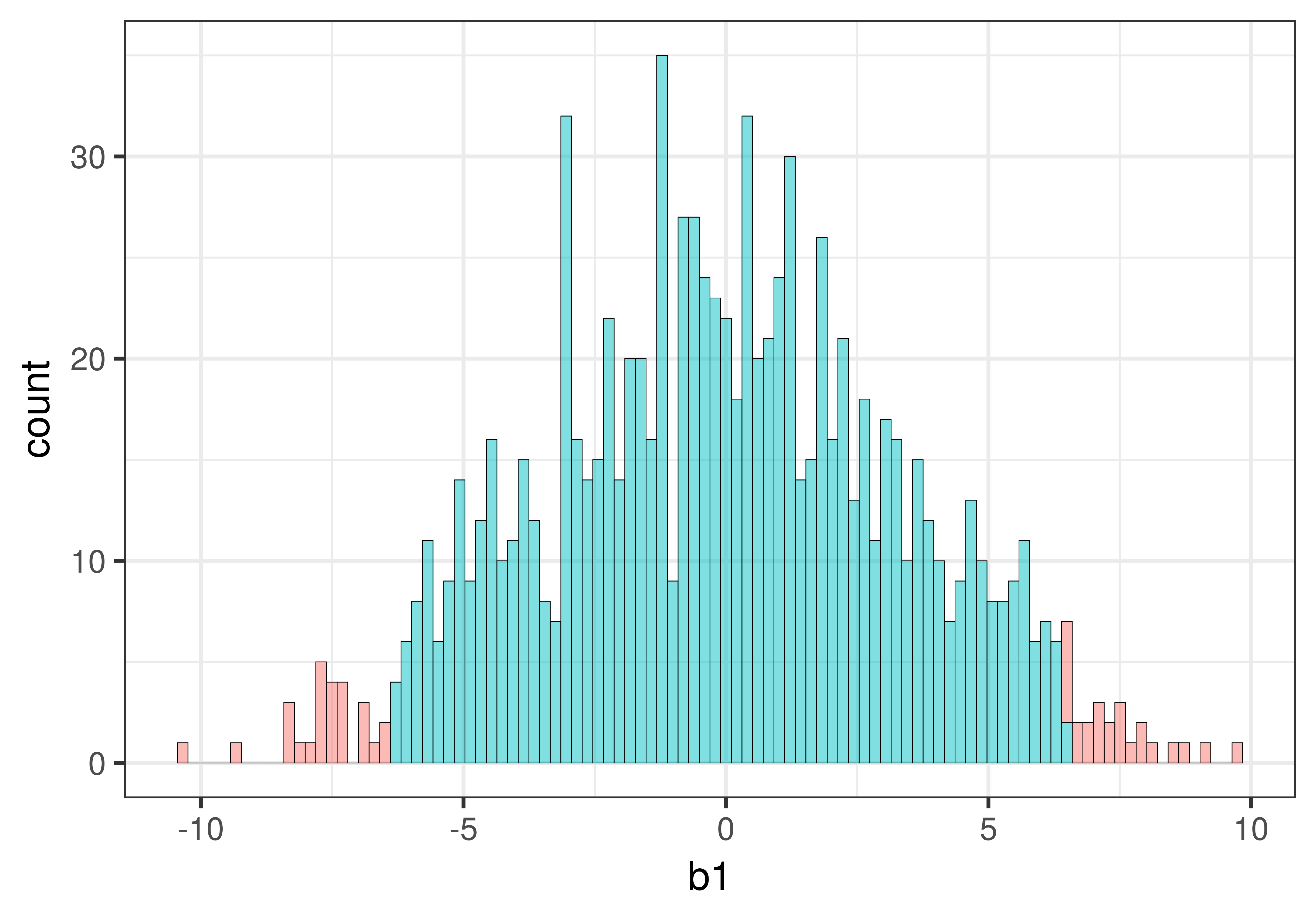
Increasing the number of bins resulted in each bin being represented by only one color. But it also created some holes in the histogram, i.e., empty bins in which none of the sample \(b_1\)s fell. This is not a problem, it’s just a natural consequence of increasing the number of bins.
Remember, this histogram represents a sampling distribution. All these \(b_1\)s were the result of 1000 random shuffles of our data. None of these is the \(b_1\) calculated from the actual tipping experiment data. All of these \(b_1\)s were created by a DGP where the empty model is true.
In the actual experiment of course, we only have one sample. If our actual sample \(b_1\) falls in the region of the sampling distribution colored red (based on the alpha we set), we will doubt that it was generated by the DGP that assumes \(\beta_1=0\). In this case, based on our alpha criterion, we would reject the empty model. This could be the right decision…
But it might be the wrong decision. If the empty model is true, .05 of the \(b_1\)s that could result from different randomizations of tables to conditions would be extreme enough to lead us to reject the empty model. If we rejected the empty model when it is, in fact, true, we would be making a Type I error. By setting the alpha at .05, we are saying that we are okay with having a 5% Type I error rate.
What is the Opposite of Unlikely?
We’re going to be interested in whether our sample \(b_1\) falls in the .05 unlikely tails. But what if it doesn’t fall in the tails but instead in the middle part of the sampling distribution? Should we then call it “likely”?
To be precise, if the sample falls in the middle .95 of the sampling distribution, it means that the sample is not unlikely. But saying that it is likely is a little bit sloppy, and possibly misleading.
In statistics, even if an event has a probability of .06, we will say it is not unlikely because our definition of unlikely is .05 or lower. But a regular person would not call something with a likelihood of .06 “likely”.
It gets tiring to say not unlikely all the time, and sometimes sentences read a little bit easier if we just say likely. Just remember that when we say likely we usually mean not unlikely. But this is not what normal people mean by the word likely.