4.4 More Ways to Visualize Relationships: Point and Jitter Plots
We have learned how to make visualizations of outcome variables as a function of explanatory variables (e.g., histograms and bar graphs in a facet grid). We will learn a few more visualizations in this section.
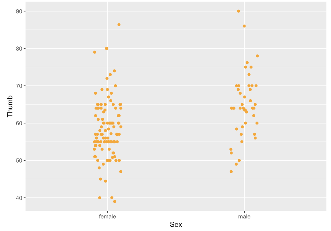
A scatterplot is a common way to show the relationship between an outcome variable and an explanatory variable. A scatterplot will show each data point as a dot on a graph. A scatterplot in ggformula can be made with the function gf_point(). Let’s try using gf_point() to examine Thumb lengths by Sex.
gf_point(Thumb ~ Sex, data = Fingers)
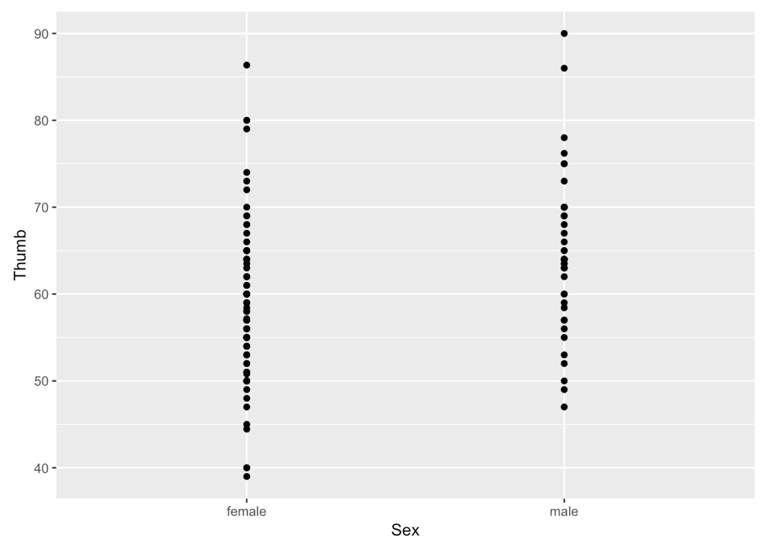
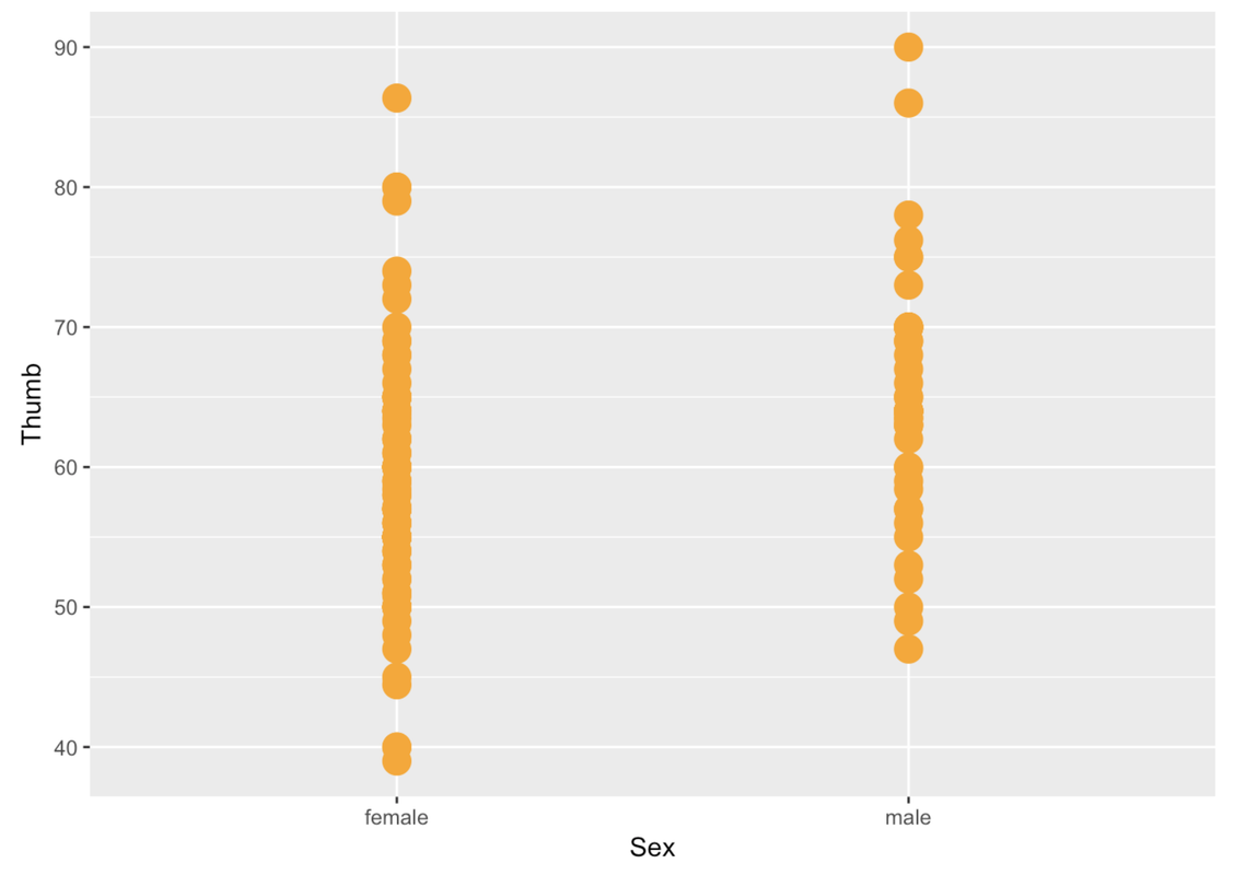
You can change the color of the points with the argument color (much like we did before) and the size of the points with size.
gf_point(Thumb ~ Sex, data = Fingers, color = "orange", size = 5)
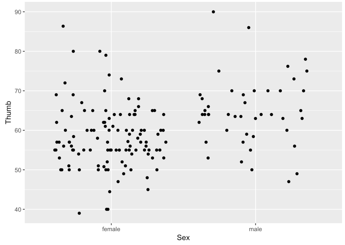
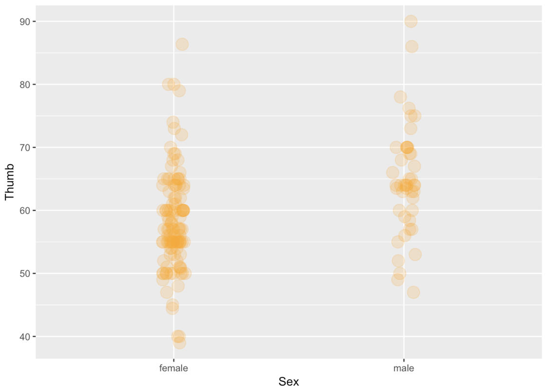
The problem with these gf_point() plots is that you can’t tell when a point is on top of another point. We can jitter these points around a little so that you can see all the individual points better. We’ll use the function gf_jitter() to create a jitter plot depicting Thumb length by Sex. This function is just like making a gf_point() plot, except that the points will be a little jittered both vertically and horizontally.
gf_jitter(Thumb ~ Sex, data = Fingers)
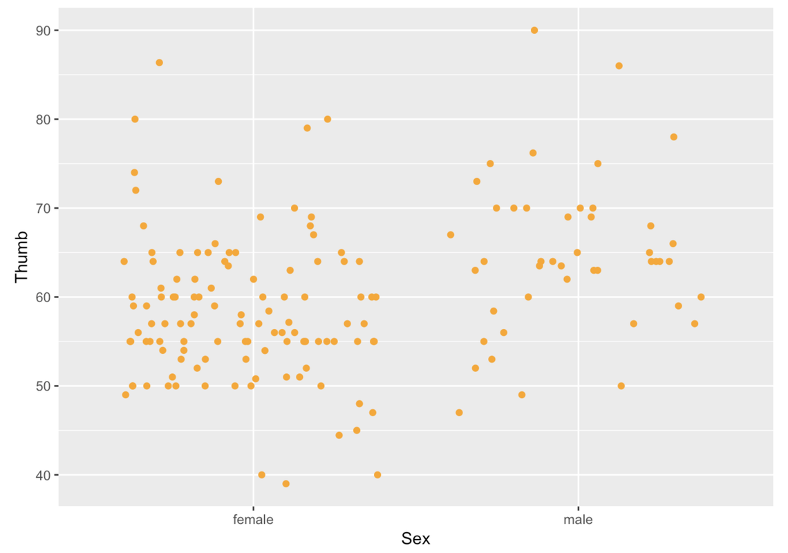
We can play with a few arguments to modify the jitter plot. As always, we can use the argument color. We can also use the argument height to change how the points get jittered vertically (i.e., a little bit up or down). In this situation, we might want the vertical jitter (height) to be set to 0 so that a point at 60 mm really is a person who has a thumb length of 60.
gf_jitter(Thumb ~ Sex, data = Fingers, color = "orange", height = 0)
We can use width to change how the points get jittered horizontally (i.e., a little bit left or right). Height and width can be set to values between 0 and 1.
gf_jitter(Thumb ~ Sex, data = Fingers, color = "orange", width = .1, height = 0)
If a point is in the Female column, it’s a female’s thumb length. But being more to the left or right within the female column doesn’t mean anything. The jitter is there just so the points do not overlap too much and obscure how many females have that thumb length.
In a jitter plot, a dense row of points shows that there are a lot of people with that thumb length. For instance, look at all the Female points at 60 mm. More points means more people with that particular thumb length.
Just like a scatterplot, in a jitter plot you can change the size of the points by including the argument size. You can also change the transparency of the points using the argument alpha. alpha can take values from 0 (more transparent) to 1 (more opaque).
gf_jitter(Thumb ~ Sex, data = Fingers, color = "orange",
   size = 5, alpha = .2, width = .05, height = 0)
Try making jitter plots for a few of the variables from the Fingers data frame. Play around with some of the arguments such as height, width, color, size, and alpha. Try making a jitter plot one way, then switching which variable is on the x-axis and which on the y-axis. Does it work both ways?
require(coursekata)

MindsetMatters <- Lock5withR::MindsetMatters %>%
    mutate(WtLost = ifelse(Wt2 < Wt, "lost", "not lost"))
# Play around with gf_jitter
gf_jitter(Thumb ~ Sex, data = Fingers)
ex() %>% check_function("gf_jitter")There isn’t any restriction on what kind of variable you can put in the x- or y-axis. You can put an outcome or explanatory variable in either position. You can also put a categorical or quantitative variable in either position. For example, in this jitter plot, we have put Sex on the y-axis and Thumb length on the x-axis.
gf_jitter(Sex ~ Thumb, data = Fingers, color = "orange")
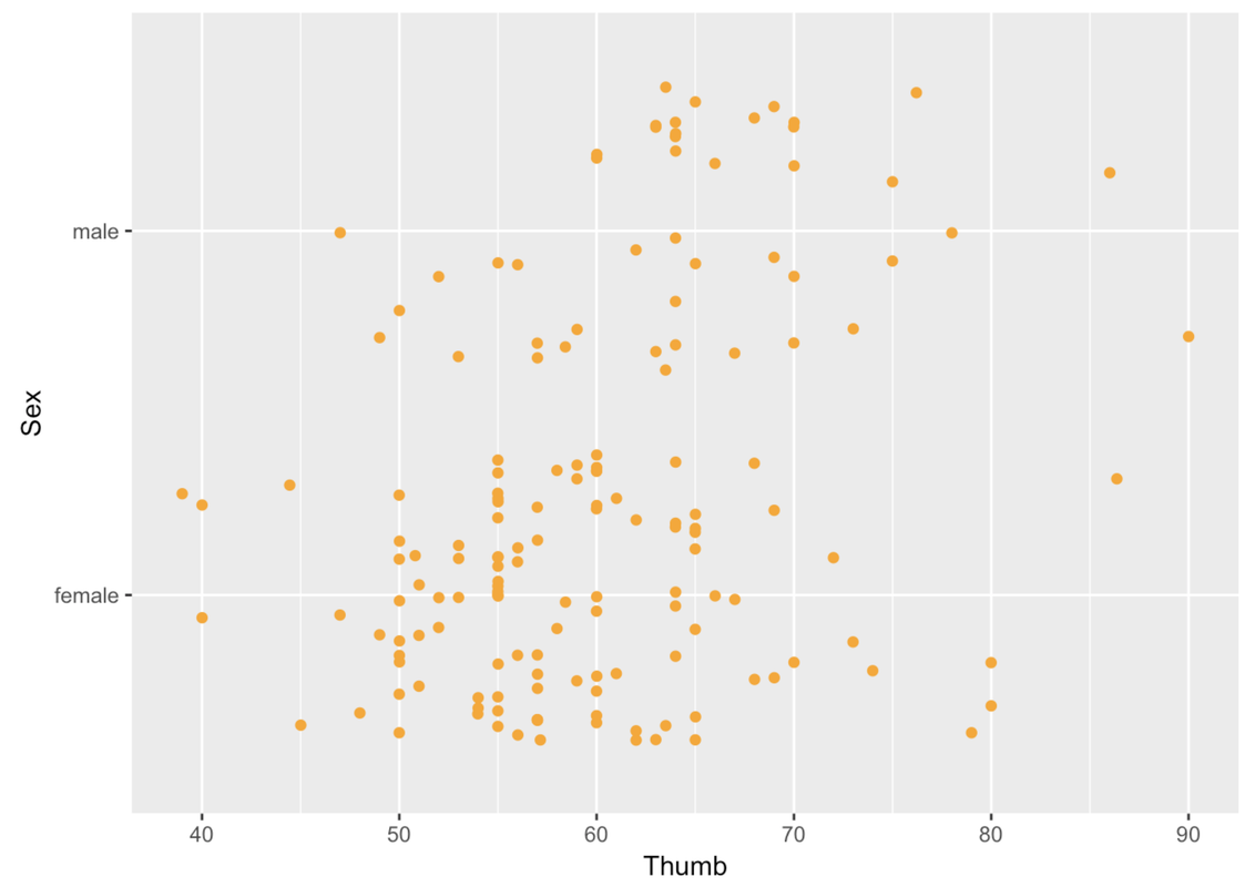
Even though you can put the outcome variable anywhere, it is more common to put the outcome variable on the y-axis. We will follow that convention in our jitter plots because it conforms with what people expect, and thus makes them easier to interpret.