4.10 Quantitative Explanatory Variables
Up to this point we have been using Height as though it were a categorical variable. First we divided it into two categories, then three.
When we do this, we are throwing away some of the information we have in our data. We know exactly how many inches tall each person is. Why not use that information instead of just categorizing people as either tall or short?
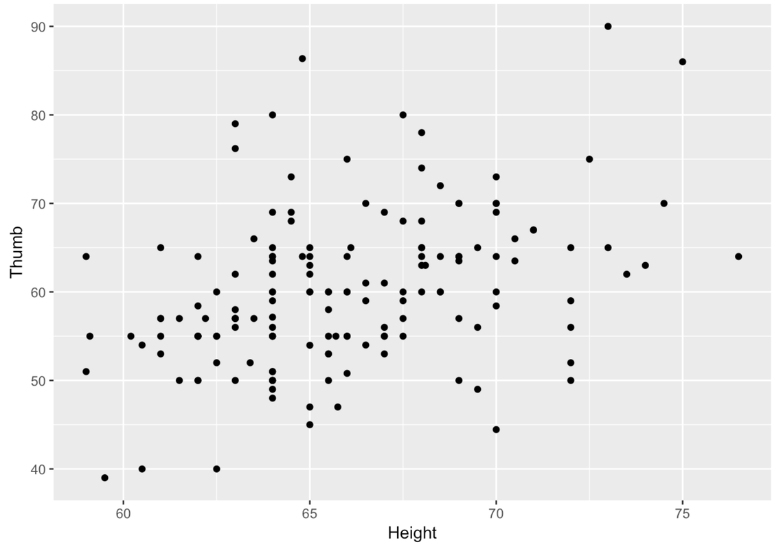
Let’s try another approach, a scatterplot of Thumb length by Height. Try using gf_point() with Height rather than Height2Group or Height3Group. Note: when making scatterplots, the convention is to put the outcome variable on the y-axis, the explanatory variable on the x-axis.
require(coursekata)
Fingers <- supernova::Fingers %>%
    mutate(Height2Group = factor(ntile(Height, 2), 1:2, c("short", "tall")))
# create a scatterplot of Thumb by Height
# create a scatterplot of Thumb by Height
gf_point(Thumb ~ Height, data = Fingers)
ex() %>% check_function("gf_point") %>% check_result() %>% check_equal(incorrect_msg = "Have you used `gf_point()`?")
The same relationship we spotted in the boxplots when we divided Height into three categories can be seen in the scatterplot. In the image below, we have overlaid boxes at three different intervals along the distribution of Height.
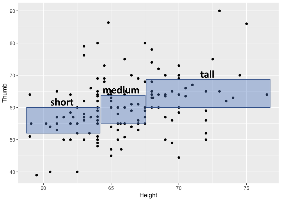
Each box corresponds to one of the three groups of our Height3Group variable. On the x-axis you can see the range in height, measured in inches, for each of the three groups.
Remember that we used ntile() to divide our sample into three groups of equal sizes. Because most people in the sample are clustered around the average height, it makes sense that the box in the middle is the narrowest. There aren’t that many people taller than 70 inches, so to get a tall group that is exactly one-third of the sample means we have to include a wider range of heights.
The heights of the boxes represent the middle of the Thumb distribution for that third of the sample, just like in a boxplot. So, the bottom of the box is Q1 and the top is Q3. You can see that the thumb lengths of people who are taller tend to be longer. You can also see that height explains only some of the variation in thumb length. Within each band of Height, there is variation in thumb length (look up and down within each box).
So, just as when we measured Height as a categorical variable, although there appears to be some variation in Thumb that is explained by Height, there is also variation left over after we have taken out the variation due to Height.
We can try to explain variation with categorical explanatory variables (such as Sex and Height3Group) but we can also try to explain variation with quantitative explanatory variable (such as Height).
Let’s stretch our thinking further. What if you wanted to have two explanatory variables for thumb length? For example, if we wanted to think about how variation in Thumb might be explained by variation in both Sex and Height, we could represent this idea as a word equation like this.
THUMB LENGTH = SEX + HEIGHT + OTHER STUFF
The variation in thumb length is the same whether we try to explain it with Sex, Height, or both! The total variation in Thumb doesn’t change. But how about that unexplained variation? The better the job done by the explanatory variables, the less left over variation.
Summary: Visualizations to Help You Explore Variation
You’ve learned many R functions that can be used to help you visualize distributions of data. In Chapter 3, you learned how to create visualizations of a single outcome variable. In Chapter 4, you learned how to create visualizations that show the relationship between an outcome variable and an explanatory variable. Let’s review when each type of visualization is appropriate to use.
| Variable | Visualization Type | R Code |
|---|---|---|
| Categorical |
Frequency Table Bar Graph |
tally
|
| Quantitative |
Histogram Boxplot |
gf_histogram
|
| Outcome Variable | Explanatory Variable | Visualization Type | R Code |
|---|---|---|---|
| Categorical | Categorical |
Frequency Table Faceted Bar Graph |
tally
|
| Quantitative | Categorical |
Faceted Histogram Boxplot Jitter Plot Scatterplot |
gf_histogram %>%
|
| Categorical | Quantitative | ||
| Quantitative | Quantitative |
Jitter Plot Scatterplot |
gf_jitter
|