9.2 Sampling Distributions: A Way to See the Variation in an Estimate
Even though we normally would only have one sample and one estimate of the population mean, we hope to have conveyed by now that this single estimate is, itself, generated from a distribution of possible estimates that could have been calculated based on different random samples.
Based on just the three estimates we have calculated so far, based on three random samples, we know that the estimates vary. But how much do they vary? And how far off could any single estimate be? To answer this question we need more than just three estimates. What we need, in fact, is a sampling distribution of means.
Sticking with our die example, let’s generate more means for the sampling distribution of means of samples of n=24. We can use the do() function to repeatedly generate random samples and compute their means. This code will generate a data frame with the means from three samples of n=24 die rolls.
do(3) * mean(resample(1:6, 24)) mean
1 3.666667
2 3.125000
3 3.708333Modify the code to generate a data frame with 10 sample means.
            require(tidyverse)
            require(mosaic)
            require(Lock5Data)
            require(supernova)
            RBackend::custom_seed(14)
            # modify this to simulate 10 sample means
            do(3) * mean(resample(1:6, 24))
            # modify this to simulate 10 sample means
            do(10) * mean(resample(1:6, 24))
            ex() %>%
                check_function("do") %>%
                check_arg("object") %>%
                check_equal()
mean
1 3.416667
2 3.333333
3 3.416667
4 3.625000
5 3.250000
6 3.541667
7 3.416667
8 3.125000
9 4.083333
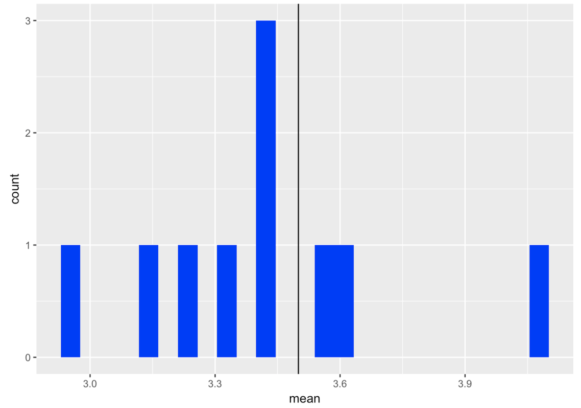
10 2.958333It is helpful to start thinking about the means of the random samples we are generating as a distribution. In fact, it is a sampling distribution of means. Just like any other distribution, it is useful to visualize the distribution and examine its shape, center, and spread.
We can already see, for example, that although some of the 10 sample means we have generated are lower than we expect (e.g., 2.96) or higher than we expect (4.08), they seem to mostly be clustered around 3.5.
Let’s take the 10 sample means we just generated and save them in a data frame using the assignment operator (<-). We’ll call the new data frame bunchofmeans. Add the code to print out the first six lines of the data frame.
            require(tidyverse)
            require(mosaic)
            require(Lock5Data)
            require(supernova)
            RBackend::custom_seed(14)
            # save the simulated 10 means
            bunchofmeans <- do(10) * mean(resample(1:6, 24))

            # look at the first 6 lines of the new data.frame
           bunchofmeans <- do(10) * mean(resample(1:6, 24))
           head(bunchofmeans)
            ex() %>% {
                check_object(., "bunchofmeans") %>% check_equal()
                check_function(., "head") %>% check_result() %>% check_equal()
            }
      mean
1 3.416667
2 3.333333
3 3.416667
4 3.625000
5 3.250000
6 3.541667
Note that the do() function returns a data frame with the function (in this case mean()) as a variable.
Make a histogram of the 10 sample means. Add a vertical line where we know the population mean is.
            require(tidyverse)
            require(mosaic)
            require(Lock5Data)
            require(supernova)
            RBackend::custom_seed(14)
            bunchofmeans <- do(10) * mean(resample(1:6, 24))

            # make a histogram of the means
            # draw a vertical line at the population mean
            bunchofmeans <- do(10) * mean(resample(1:6, 24))

            # make a histogram of the means
            # draw a vertical line at the population mean
            gf_histogram(~mean, data = bunchofmeans, fill = "blue") %>%
            gf_vline(xintercept = 3.5)
            ex() %>% {
                check_function(., "gf_histogram") %>% {
                    check_arg(., "object") %>% check_equal()
                    check_arg(., "data") %>% check_equal()
                }
                check_function(., "gf_vline") %>%
                    check_arg("xintercept") %>% check_equal()
            }
It’s a lot easier to look at a distribution of sample means when they are in a histogram than as just a list of means. In fact, why limit ourselves to 10 samples? Let’s simulate a lot of samples (let’s try 1,000) and examine the resulting distribution—the sampling distribution—of 1,000 means.
Modify the code below to simulate 1,000 samples. We have added code to plot the means on a histogram and chained on a vertical line for the expected mean of the population (3.5).
            require(tidyverse)
            require(mosaic)
            require(Lock5Data)
            require(supernova)
            RBackend::custom_seed(14)
            # modify this for 1000 samples
            bunchofmeans <- do(10) * mean(resample(1:6, 24))

            # this makes a histogram of the means
            gf_histogram(~mean, data = bunchofmeans, fill = "blue") %>%
                gf_vline(xintercept = 3.5) %>%
                gf_labs(title = "Distribution of Means")
            # modify this for 1000 samples
            bunchofmeans <- do(1000) * mean(resample(1:6, 24))

            # this makes a histogram of the means
            gf_histogram(~mean, data = bunchofmeans, fill = "blue") %>%
                gf_vline(xintercept = 3.5) %>%
                gf_labs(title = "Distribution of Means")
            ex() %>% {
                check_object(., "bunchofmeans") %>% check_equal()
                check_function(., "gf_histogram")
                check_function(., "gf_vline")
                check_function(., "gf_labs")
            }
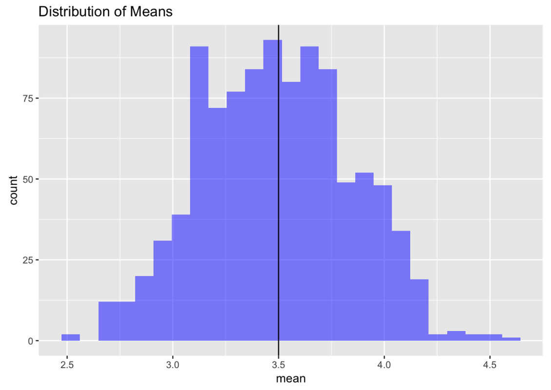
In previous chapters, when we created histograms we were looking at distributions of individual units—people, fingers, countries. But this is a new kind of distribution. This histogram shows a distribution of sample means, each summarizing a single sample of 24 die rolls.
This kind of distribution is called a sampling distribution. Be careful: when you say these words out loud, the word “sample” sounds a lot like “sampling.” But this is not a sample distribution; it is a distribution of samples. Sometimes we will also call this a distribution of estimates (in this case, the estimate, calculated from each sample, is the mean).
We know, and have demonstrated, that the DGP of rolling a die would result in a uniform distribution of individual die rolls; each side should appear on 1/6 of the rolls over time. But when we take the means of many samples of die rolls, we end up with something that looks a lot like a normal distribution.
It is important to note that the distribution of an estimate may not have the same shape as the population distribution. And, as we also have shown, the distribution of an individual sample need not resemble either the population distribution or the sampling distribution. It is important to keep these three kinds of distributions straight, each with its own meaning and purpose.
Why We Need Sampling Distributions
Let’s go back to the problem we started with: How far off could an estimate of a population mean be if based on a single sample of n=24? To answer this question, we need a sampling distribution of means.
Take a look at the sampling distribution we just created of 1,000 samples of n=24 die rolls. We can see that the center of this distribution appears to be very close to what we know the population mean to be in this case: 3.5.
But we also can see a lot of variation in sample means around the population mean. Some of the randomly-generated sample means, though not many, are as low as 2.5. Others, though again not many, are as high as 4.5.
What this means is that if we had only chosen one random sample of n=24, there is a chance that our estimate of the mean could have been off by as much as 1—either 1 lower, or 1 higher—than the true population mean. But, based on the sampling distribution we constructed, we can say that it is unlikely that our estimate would be off by more than 1.
Sampling distributions thus provide the context for understanding the meaning of an individual sample estimate. Earlier in the course, we made the point that to understand what an individual score means, it helps to know what distribution it came from. In the example of Kargle, we saw that we couldn’t really understand what a score of 20,000 points meant unless we knew something about the distribution of all Kargle scores.
If we know that the mean Kargle score is 10,000, and the standard deviation is 2,000, then we can see that a score of 20,000 is impressive—5 standard deviations above the mean! But if we don’t know about the distribution of Kargle scores, we are hampered in our efforts to know what a score of 20,000 means.
The same is true of estimates: to understand how to interpret an estimate, it helps to know something about the distribution it came from—the sampling distribution of the estimate. If we can figure out what the sampling distribution looks like, then we can make some guesses about how wrong our estimate might be, or how confident we should be in our estimate.
One thing that makes sampling distributions hard to understand is that they are imaginary—made up. If we are talking about scores in a video game, we can actually look at the distribution of scores. But for a sampling distribution we are imagining what the distribution would have looked like if we were to re-do the study many times. This is not easy to understand.
Sampling distributions give us a way to quantify the margin of possible error in our estimates. So far, we have looked at a sampling distribution when we already know something about the population (e.g., the DGP, the population mean). Later we will show you how to create sampling distributions when you don’t know the true population mean, based only on the sample you have.