Chapter 11 - Model Comparison with the F Ratio
You should be feeling your personal statistical power grow! You now know how to specify models for explaining variation, and how to fit those models to your data by estimating the parameters. You also know how to construct sampling distributions and build confidence intervals around parameter estimates, and how to use these confidence intervals to decide which model—simple or complex—you want to retain, and which you want to reject.
With all this under your belt, you can go far! However, we would be remiss if we did not give you one more superpower: We need to teach you how to use the F ratio for directly comparing models. We developed the F ratio back in Chapter 5. We will start there. Then we will show you how everything you have learned in the meantime can be used to transform F from an esoteric statistic into a highly effective tool for model comparison. But first, let’s go back long, long ago, to the Tipping experiment from Chapter 4.
11.0 The Tipping Experiment Revisited
Back in Chapter 4 we learned about an experiment in which researchers sought to figure out whether putting hand-drawn smiley faces on the back of the check would cause restaurant servers to receive higher tips. Rind, B., & Bordia, P. (1996). Effect on restaurant tipping of male and female servers drawing a happy, smiling face on the backs of customers’ checks. Journal of Applied Social Psychology, 26(3), 218-225.
The study was a randomized experiment. A female server in a particular restaurant was asked to either draw a smiley face—or not—for each table she served, following a predetermined random sequence. The outcome variable was the amount of tip left by each table. Distributions of tip amounts in the two groups (n=22 tables per condition) are shown below.
gf_dhistogram(~ Tip, data = TipExperiment, fill = "yellowgreen", color = "black", alpha = 1) %>%
gf_facet_grid(Condition ~ .) %>%
gf_labs(title = "Tip Experiment")
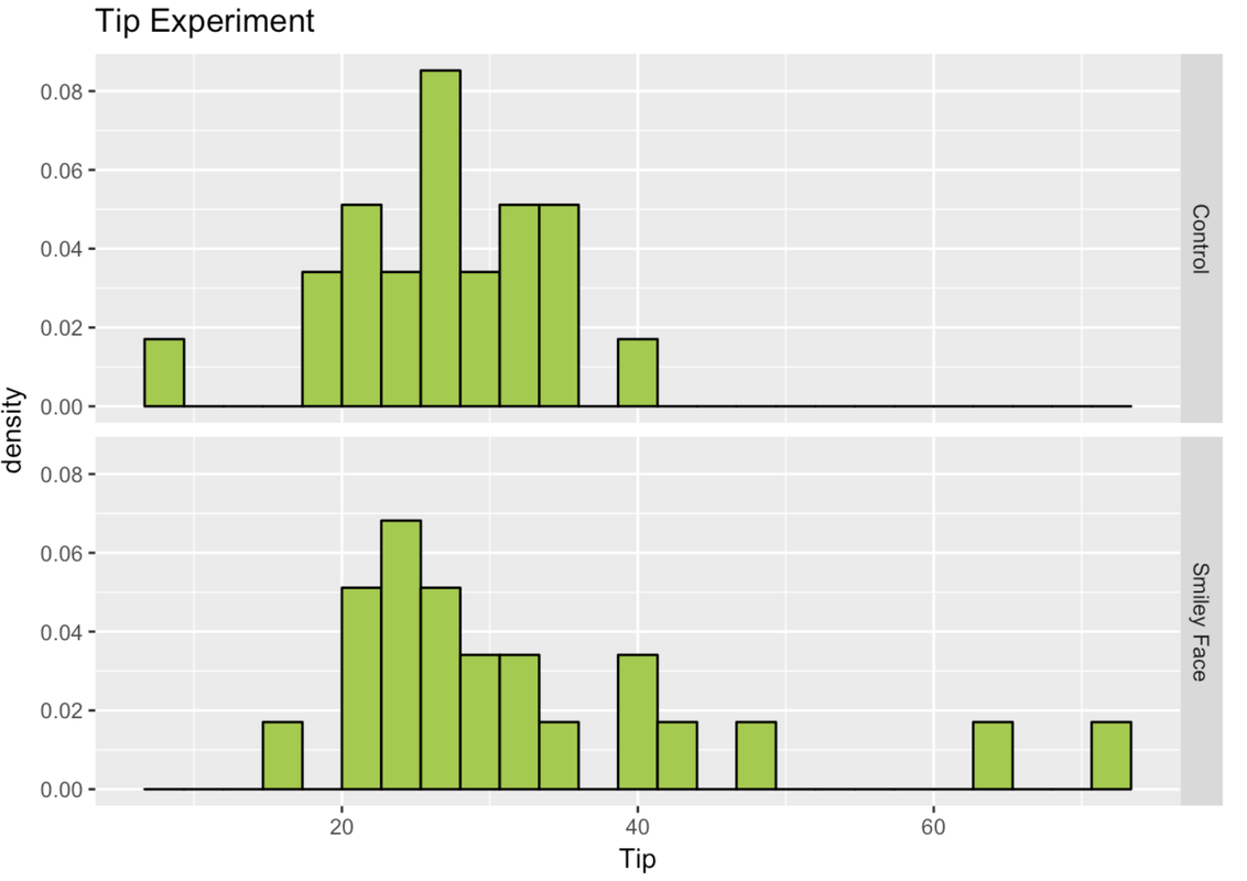
We learned about this experiment in Chapter 4; but now we have a lot more tools in our toolbox! Back then, we didn’t even calculate the means for the two groups. We can take a look at the favstats for Tips from the two conditions in the experiment (we’ll also save them as Tip.stats).
Tip.stats <- favstats(Tip ~ Condition, data = TipExperiment)
Tip.stats
Condition min Q1 median Q3 max mean sd n missing
1 Control 8 22.25 28.0 31.0 39 27.00000 6.969321 22 0
2 Smiley Face 17 24.00 28.5 38.5 72 33.04545 13.953929 22 0Below, we made a gf_point() plot of the two groups, and overlaid the mean of each group.
gf_point(Tip ~ 1, data = TipExperiment, size=4, alpha=.5, color = "firebrick") %>%
gf_facet_grid(. ~ Condition) %>%
gf_hline(yintercept = ~mean, data = Tip.stats)
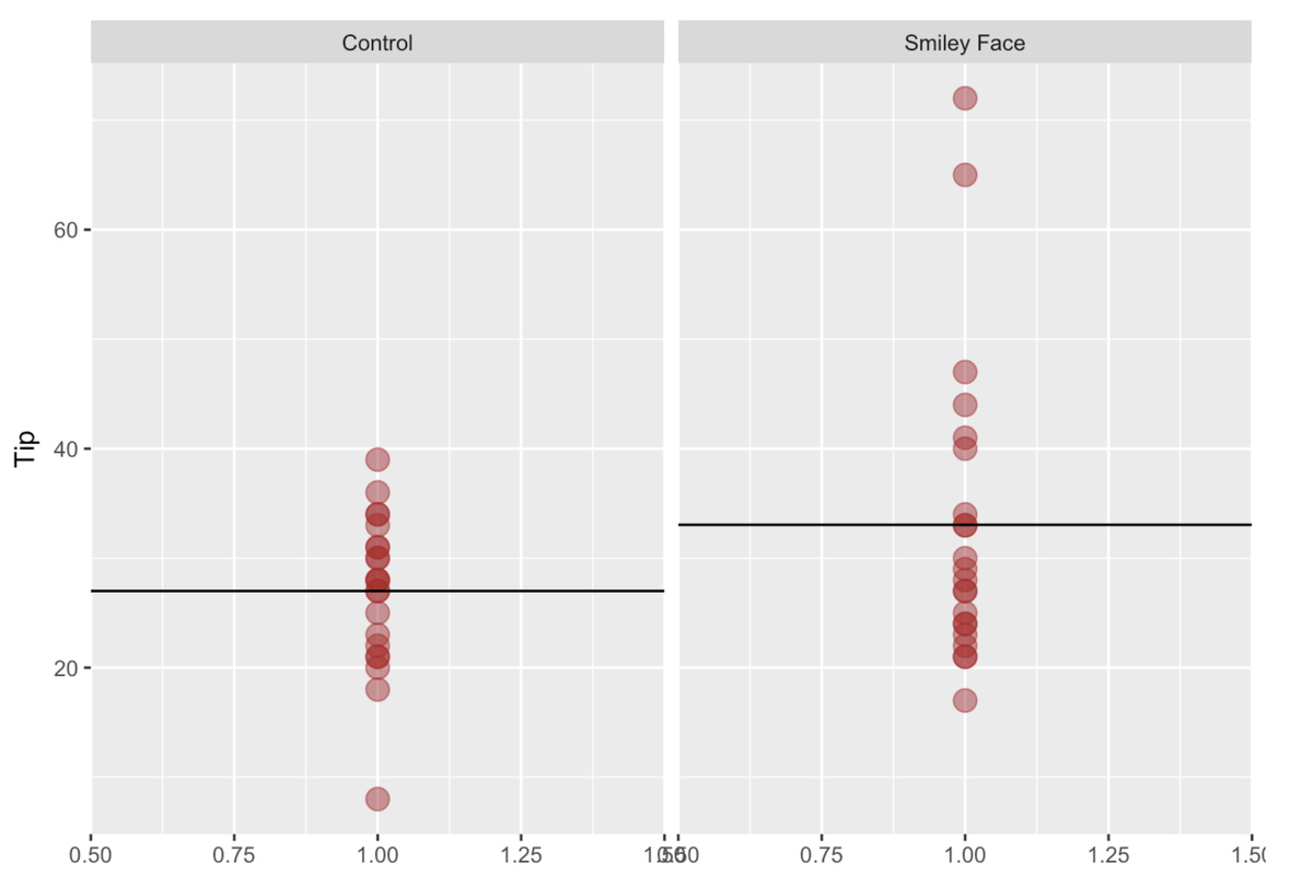
In the plot, you can clearly see there is a mean difference between the two groups. In fact, the mean for the Control group is $27, whereas the mean for the Smiley Face group is about $33, which means there was a mean difference of about $6 in favor of the Smiley Face condition.
Specifying a Model Comparison
The research question in this study concerned the effect of smiley faces on tips: Did tables randomly assigned to get smiley faces on their checks give higher tips than the tables that got no smiley faces?
You now have the tools to state this question in terms of a comparison between two models: the empty model, in which the grand mean is used to predict tips, versus the two-group model, in which knowing which group a table is in improves the prediction.
Using GLM notation, the researchers who conducted the tipping study were seeking to compare these two models:
\(Y_{i}=b_{0}+b_{1}X_{i}+e_{i}\) (the two-group model; we also call this “complex”)
\(Y_{i}=b_{0}+e_{i}\) (the empty model; we also call this “simple”)
In the two-group model, \(b_0\) represents the mean of one group (for example, it could be the mean of the Control group), and \(b_1\) the increment that would be added to get to the mean of the other group (e.g., the Smiley Face group).
Fitting the Models
Let’s find the best-fitting estimates for the two-group model.
            require(tidyverse)
            require(mosaic)
            require(Lock5Data)
            require(okcupiddata)
            require(supernova)
            # fit the two-group model and save it as Condition.model
            Condition.model <-

            # print out the best-fitting estimates
        	# fit the two-group model and save it as Condition.model
            Condition.model <- lm(Tip ~ Condition, data = TipExperiment)

            # print out the best-fitting estimates
            Condition.model
        	ex() %>% {
                check_output_expr(., "Condition.model")
                check_object(., "Condition.model") %>% check_equal()
            }
Call:
lm(formula = Tip ~ Condition, data = TipExperiment)

Coefficients:
         (Intercept)  ConditionSmiley Face
              27.000                 6.045
What does it mean for these to be the best-fitting estimates? Even though we do not know what the true population parameters are, this is the best model we can come up with based on our data:
\[Y_i = 27 + 6.05X_i + e_i\]
This set of estimates is “best” because it minimizes the error measured in a specific way: sum of squares (SS). Let’s take a look at the SS Error (as well as the SS Total and SS Model, and let’s also look at PRE while we are at it) from this model in the code window below. (Assume that Condition.model has already been saved for you.)
            require(tidyverse)
            require(mosaic)
            require(Lock5Data)
            require(okcupiddata)
            require(supernova)

            Condition.model <- lm(Tip ~ Condition, data = TipExperiment)
# take a look at the sum of squares from the Condition.model
            # take a look at the sum of squares from the Condition.model
            supernova(Condition.model)
            # TODO: This doesn't really check that all of the SS were output -- a student will be marked incorrect if they use supernova(Condition.model)$tbl$SS even though it prints out the correct data
            # (Unlikely example)

            ex() %>% check_output_expr("supernova(Condition.model)")
 Analysis of Variance Table
 Outcome variable: Tip
 Model: lm(formula = Tip ~ Condition, data = TipExperiment)

                              SS df     MS     F    PRE     p
 ----- ----------------- ------- -- ------ ----- ------ -----
 Model (error reduced) |  402.02  1 402.02 3.305 0.0729 .0762
 Error (from model)    | 5108.95 42 121.64
 ----- ----------------- ------- -- ------ ----- ------ -----
 Total (empty model)   | 5510.98 43 128.16
The two-group model will, of course, reduce error compared with the empty model in the sample distribution.
But we know, at this point, that the observed mean difference (\(b_1\)) between the two groups in this particular sample is only one of many possible mean differences that could have occurred if different random samples had been selected.
Our real question is: Will knowing which group someone is in (Smiley Face or Control) necessarily result in an improved prediction of tips in the future? Or, to ask this another way, does the smiley face actually produce a difference in the Data Generating Process (DGP)—the tip generating process? Which of these two models is a better model of the DGP?
Comparing the Models by Constructing a Confidence Interval
In the previous chapter we compared two models by constructing a confidence interval around the parameter that differentiates the two models, which, in this case, is \(b_1\), or the difference in means between the two groups. We can also think of \(b_1\) as the increment to go from one group to the other.
By constructing a confidence interval around this difference, we can determine whether, with 95% confidence, we could rule out the possibility that \(b_1\) is equal to 0, and thus adopt the two-group model over the empty model.
To construct a confidence interval, we first need to construct a sampling distribution to put our estimate of \(b_1\) in context. One simple way to do this, for the current study, is to use a bootstrapping (or resampling) technique, the resample() function in R.
SDob1 <- do(1000) * b1(Tip ~ Condition, data = resample(TipExperiment, 44))Use the code window to run the code. Then add (and run) a command to output the first six rows of the resulting data frame.
            require(tidyverse)
            require(mosaic)
            require(Lock5Data)
            require(okcupiddata)
            require(supernova)

            RBackend::custom_seed(50)
            # run this code
            SDob1 <- do(1000) * b1(Tip ~ Condition, data = resample(TipExperiment, 44))

            # show the first 6 lines of this data frame
            # run this code
            SDob1 <- do(1000) * b1(Tip ~ Condition, data = resample(TipExperiment, 44))

            # show the first 6 lines of this data frame
            head(SDob1)
            ex() %>% check_object("SDob1") %>% check_equal(incorrect_msg = "Make sure you don't delete the code to create SDob1")
            ex() %>% check_function("head") %>% check_result() %>% check_equal(incorrect_msg = "did you call head() on SDob1?")
         b1
1  6.495726
2  7.105590
3 11.419643
4  7.604555
5  4.032680
6  4.416667
The column labelled b1 contains the 1,000 mean differences from the resamples of TipExperiment.
SDob1 is the sampling distribution of 1,000 increments created by resampling the 44 tables in the sample 1,000 times. We used the following code to plot this bootstrapped sampling distribution in a histogram, with the mean of the sampling distribution indicated by the vertical line, like this:
gf_histogram(~ b1, data = SDob1, fill = "orange") %>%
gf_vline(xintercept = mean(SDob1$b1), color = "purple")
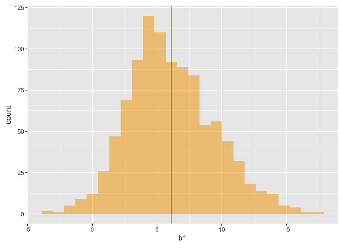
The sampling distribution gives us a way of judging whether the true difference in the DGP could have been 0. This is important to know, because if the difference we observed could have occurred with a true difference of 0, then we don’t have very good evidence that smiley faces affect tips. If the true difference could have been 0, then we should leave Condition out of our model and just stick with using the empty model.
We can see just by looking at the sampling distribution that a difference of 0 is somewhat unlikely (out in the lower tail), but certainly not completely unexpected. We could order this sampling distribution and look at the 25th largest and 25th smallest b1.
Instead of using bootstrapping, we could use the t distribution to construct the 95% confidence interval for the mean difference in tips between the two conditions. The confint function uses the t distribution to calculate the confidence interval around the parameters estimated in our Condition.model. Add code that will calculate the 95% Confidence Interval and press Run.
            require(tidyverse)
            require(mosaic)
            require(Lock5Data)
            require(okcupiddata)
            require(supernova)
            Condition.model <- lm(Tip ~ Condition, data = TipExperiment)

            # add code to calculate the 95% confidence interval around our estimates
            Condition.model <- lm(Tip ~ Condition, data = TipExperiment)

            # add code to calculate the 95% confidence interval around our estimates
            confint(Condition.model)
            ex() %>%
                check_function("confint") %>%
                check_result() %>%
                check_equal()
                         2.5 %   97.5 %
(Intercept)          22.254644 31.74536
ConditionSmiley Face -0.665492 12.75640
Based on the data from the Tipping experiment, the true mean difference of the DGP could be as high as 12.76. On the other hand, it could be as low as -0.67. That’s a pretty big range. Importantly, it includes the possibility that the true DGP is 0. With 95% confidence, we can’t rule out the possibility that the empty model is true, and so we will stick with the empty model for now.