Course Outline
-
segmentGetting Started (Don't Skip This Part)
-
segmentStatistics and Data Science: A Modeling Approach
-
segmentPART I: EXPLORING VARIATION
-
segmentChapter 1 - Welcome to Statistics: A Modeling Approach
-
segmentChapter 2 - Understanding Data
-
segmentChapter 3 - Examining Distributions
-
segmentChapter 4 - Explaining Variation
-
segmentPART II: MODELING VARIATION
-
segmentChapter 5 - A Simple Model
-
segmentChapter 6 - Quantifying Error
-
segmentChapter 7 - Adding an Explanatory Variable to the Model
-
segmentChapter 8 - Models with a Quantitative Explanatory Variable
-
segmentPART III: EVALUATING MODELS
-
segmentChapter 9 - Distributions of Estimates
-
segmentChapter 10 - Confidence Intervals and Their Uses
-
segmentChapter 11 - Model Comparison with the F Ratio
-
11.3 The F Distribution
-
segmentChapter 12 - What You Have Learned
-
segmentFinishing Up (Don't Skip This Part!)
-
segmentResources
list full book
11.3 The F Distribution
So far we’ve used randomization to create a sampling distribution of F values. However, we could also use bootstrapping and simulation. But these computational methods aren’t the only ways to construct sampling distributions of F. Just as mathematicians have developed probability models for the normal distribution (the z, and more useful t, distributions), mathematicians have also developed a probability distribution that does a good job modeling the sampling distribution of F. It’s called the F distribution.
The F distribution is a probability distribution that is often used to model the sampling distribution of F. This theoretical distribution takes into account both model and error degrees of freedom. In the same way that a normal distribution can be used as a smooth idealization of sampling distributions of \(b_1\)s, the F distribution is a smooth mathematical object used to represent sampling distributions of F values.
Just as the shape of the t distribution varies slightly according to the degrees of freedom (n-1), the shape of the F distribution also varies by degrees of freedom. But because F is calculated as the ratio of MS (mean square) for model divided by MS for error, we must specify two different degrees of freedom to get the shape of the F distribution, one for the the model and one for error. The df for MS model is 1 in the supernova table below; the df for MS error is 42.
 Analysis of Variance Table
 Outcome variable: Tip
 Model: lm(formula = Tip ~ Condition, data = TipExperiment)

                              SS df     MS     F    PRE     p
 ----- ----------------- ------- -- ------ ----- ------ -----
 Model (error reduced) |  402.02  1 402.02 3.305 0.0729 .0762
 Error (from model)    | 5108.95 42 121.64
 ----- ----------------- ------- -- ------ ----- ------ -----
 Total (empty model)   | 5510.98 43 128.16
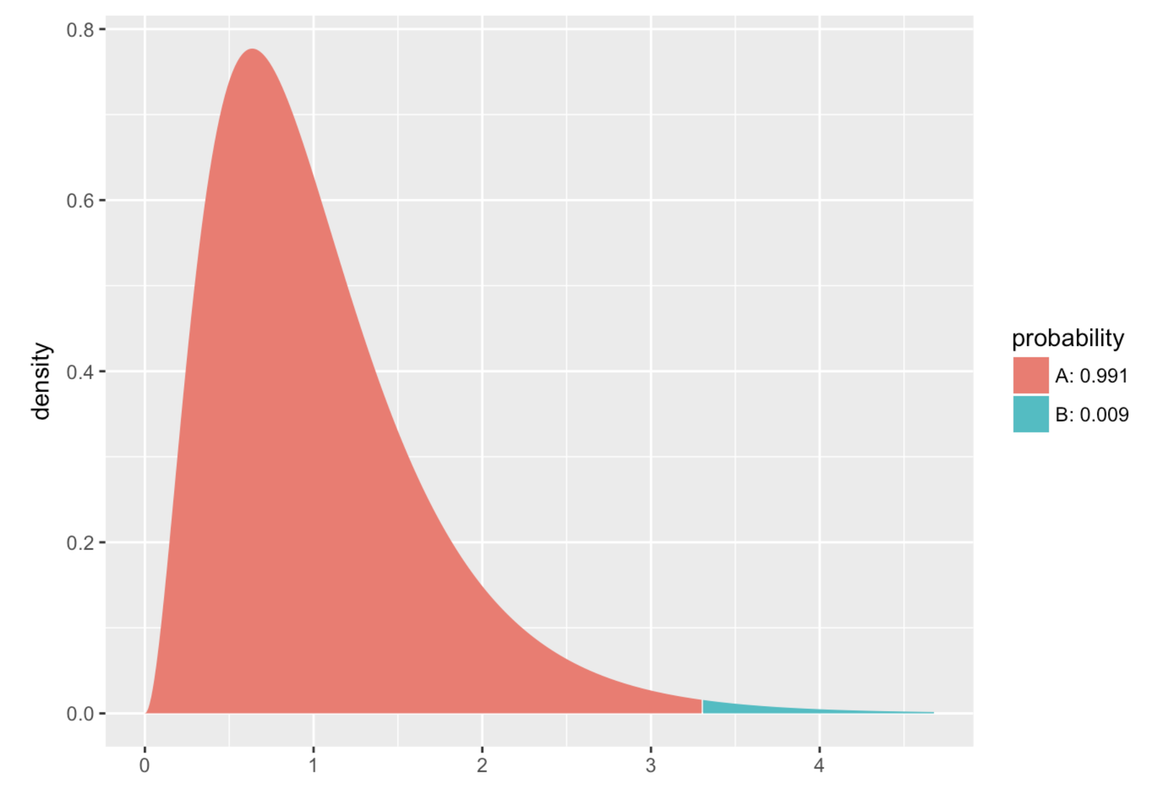
In the Smiley Face experiment, you can see from the supernova() table above that you have 1 df in the numerator, and 42 in the denominator. Below, on the right, we’ve plotted the theoretical F distribution for an F ratio with 1 and 42 degrees of freedom (on the right). We’ve colored the part of this smooth theoretical distribution greater than our sample F in bluish-green. For comparison, on the left, we’ve put the sampling distribution of F we created with randomization (using shuffle()).
xpf(sampleF, df1=1, df2=42)

As you can see, the smooth F distribution does a pretty good job modeling the shape of the randomized sampling distribution we created. And because the F distribution is a mathematically defined probability distribution, R can easily calculate the probability of obtaining a score in any particular region of the curve.
Let’s break down the code we used to get the probability in the F distribution. The function xpf() is about the F distribution, and more specifically about getting the p-value from the F distribution. The x in front of the function is just there because there is another version of this function called pf() that does not also print out a picture. We prefer xpf() so that the plot of this mathematical distribution automatically gets printed as well.
The entire line of code xpf(sampleF, df1=1, df2=42) asks R to return the probability of getting an F ratio more extreme than our sample F (which was 3.305), if the empty model were true. The empty model represents a DGP where any differences between groups were the result of chance. All the Fs that could result from running this empty model DGP is modeled by the F distribution with a df1 = 1 and df2 = 42. The df1 stands for the model df and df2 stands for error df.
The results of this command show us that the probability of getting an F of 3.305 or greater in a study with 1 and 42 degrees of freedom if the empty model is true is .076. This, again, is very close to the probability we got from generating a sampling distribution using randomization (shuffle). In fact, whether we use the randomized PRE distribution, randomized F, or probability distribution of F, the probability of getting an estimate as high as the one observed in the Smiley Face study was, rounded off, .08 in all three cases.
It’s also worth noting that the .076 we got using the F probability calculator is exactly the same as we get in the p column of the supernova() table. This is not an accident. The function supernova() uses the F distribution to calculate the probability of getting the F value we calculated from the data, or one more extreme, if the empty model were true.
Exploring the F Distribution
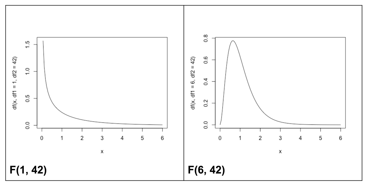
The shape of the F distribution can change quite markedly as the degrees of freedom in the numerator and denominator of the F ratio change. Here are just two examples, produced using variants of this R code:
curve(df(x, df1=1, df2=42), from=0, to=6)curve(df(x, df1=6, df2=42), from=0, to=6)

We know from using the xpf() function introduced previously, that the probability of getting an F of 3.305 if the empty model is true, would be .076. Modify the code in the code window below to determine what the probability would be if our complex model used six degrees of freedom.
            require(tidyverse)
            require(mosaic)
            require(Lock5Data)
            require(okcupiddata)
            require(supernova)

            RBackend::custom_seed(241)
            sampleF <- fVal(Tip ~ Condition, data = TipExperiment)
            # edit this to explore the F distribution with df model = 6
            xpf(sampleF, df1 = 1, df2 = 42)
            # edit this to explore the F distribution with df model = 6
            xpf(sampleF, df1 = 6, df2 = 42)
            ex() %>%
                check_function("xpf") %>% {
                    check_arg(., "df1")
                    check_arg(., "df2")
                }

You can see that the probability of getting an F of 3.305 or higher in a study with more groups (more model degrees of freedom), but the same number of error degrees of freedom (42), would be much lower (assuming that the empty model were true).
You can take a look at these F distributions as the df model increases. They were all generated with the same df2. We only changed the df1 (the number of additional parameters in our complex model). Try to describe the pattern you observe.

Try out this app (follow the link below) to further explore how degrees of freedom alter both the shape and probability calculations of the F distribution.
(Click here to give it a try.)
The point we want to make is this: the F distribution has a bunch of subtly different shapes based on the df model (df1) and df error (df2). But all F distributions generated from the empty model have a mean of 1. You don’t need to know exactly how the F distributions vary with df1 and df2 (for now). We mostly want to equip you with a tool—you can always run xpf() to see a picture!