9.7 Reasoning With Sampling Distributions (Continued)
Reasoning Backward
The logic of reasoning forward makes sense. But unfortunately, it doesn’t directly address our research question. Whereas reasoning forward requires you to first hypothesize what you think the mean of the population is, in reality we don’t know what that mean is. In reasoning backward, we will start with the sample and then end with possible DGP/populations.
We do have the mean of one sample—the one we are analyzing. In reasoning backward, we are simply saying: given the sample mean that we observed, what is the likelihood that the true population mean is above some specific level, or below some specific level? In other words, how accurate is our estimate of the population mean?
Let’s go through this reasoning using our actual sample of 157 students’ thumb lengths. You know, by now, that their mean thumb length is 60.1 mm, and the standard deviation of their thumb lengths is 8.73 mm. Here’s a histogram of our sample data.
gf_histogram(~ Thumb, data = Fingers) %>%
gf_vline(xintercept=60.1, color = "blue")
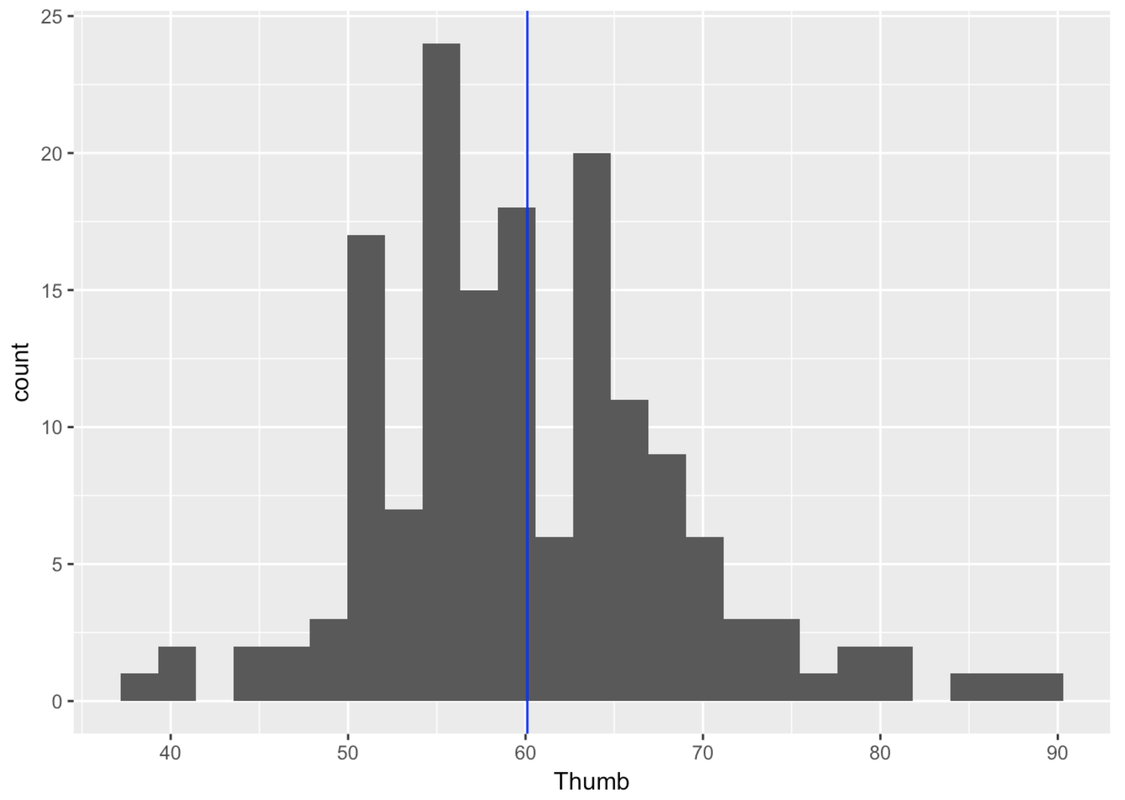
Based on our sample, we know that our best unbiased estimate of the population mean (\(\mu\)) is 60.1, and of the population standard deviation (\(\sigma\)), 8.73. But we also know that these estimates are wrong due to sampling variation. If we had collected a different sample, we would have gotten a different estimate. Our question is: how accurate is our estimate of the population mean?
Start With Some Assumptions
In order to reason backwards, we are going to make some assumptions about the DGP and/or population. In fact, we are going to make two assumptions:
First, we are going to assume that the shape of the population distribution of thumb length is normal, which seems reasonable based on our sample distribution and everything else we know about the distributions of quantitative variables.
Second, we are going to assume that the standard deviation of the population (\(\sigma\)) is 8.73, as estimated.
We are specifically NOT going to assume we know what the population mean is; that’s what we are trying to find out.
Simulate Some Sampling Distributions
The next step is to put our observed mean thumb length (60.1) in the context of a distribution it could have come from. Our observed mean of 60.1 is only one of the possible means we could have obtained by randomly selecting a sample of 157 students.
You already know how to simulate a sampling distribution based on assumptions about the population. Let’s start by simulating a sampling distribution for samples of n=157. Assume a normal shape for the population, and a standard deviation of 8.73.
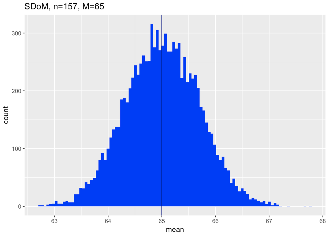
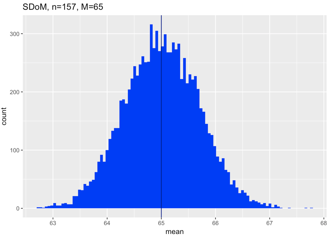
Then we need to imagine: what population might have generated our sample? And, just to start, what about a population with a mean of 65 mm? How did we come up with that number? We’re just trying it out. Later, we’ll think about why we started here. But for now just remember that all of this reasoning with sampling distributions is predicated on saying, “If…”
We’ve put in the code to simulate a sampling distribution based on our assumptions, and then to make a histogram of the distribution of the sampling distribution. Notice we also titled the histogram so we would remember what it is: a sampling distribution of means made up of samples of n=157 from a population with a mean of 65. Go ahead and push Run.
            require(tidyverse)
            require(mosaic)
            require(Lock5Data)
            require(supernova)

            RBackend::custom_seed(25)
            Thumb.stats <- favstats(~Thumb, data = Fingers)
            # change the population mean to 65
            SDoM <- do(1000) * mean(rnorm(157, mean = Thumb.stats$mean, sd = Thumb.stats$sd))

            # this creates a histogram of this SDoM
            gf_histogram(~mean, data = SDoM, bins = 100, fill = "blue") %>%
                gf_vline(xintercept = 65, color = "darkblue") %>%
                gf_labs(title = "SDoM, n=157, M=65")
            # change the population mean to 65
            SDoM <- do(1000) * mean(rnorm(157, mean = 65, sd = Thumb.stats$sd))

            # this creates a histogram of this SDoM
            gf_histogram(~mean, data = SDoM, bins = 100, fill = "blue") %>%
                gf_vline(xintercept = 65, color = "darkblue")%>%
                gf_labs(title = "SDoM, n=157, M=65")
ex() %>% check_object("SDoM") %>% check_equal()
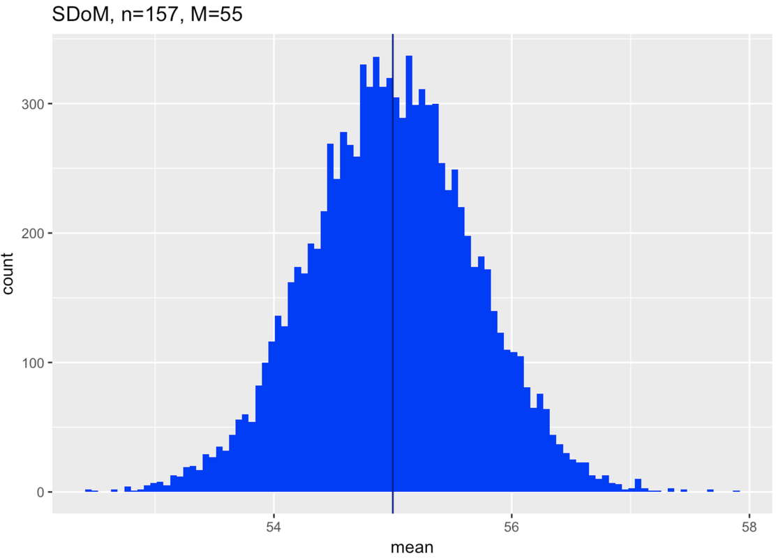
Make two more sampling distributions by editing the code in the windows below. First construct a sampling distribution with a mean of 55.
            require(tidyverse)
            require(mosaic)
            require(Lock5Data)
            require(supernova)

            RBackend::custom_seed(25)
            Thumb.stats <- favstats(~Thumb, data = Fingers)
            # change the population mean to 55
            SDoM <- do(1000) * mean(rnorm(157, mean = Thumb.stats$mean, sd = Thumb.stats$sd))

            # this creates a histogram of this SDoM
            gf_histogram(~mean, data = SDoM, bins = 100, fill = "blue") %>%
                gf_vline(xintercept = 55, color = "darkblue") %>%
                gf_labs(title = "SDoM, n=157, M=55")
            # change the population mean to 55
            SDoM <- do(1000) * mean(rnorm(157, 55, Thumb.stats$sd))

            # this creates a histogram of this SDoM
            gf_histogram(~mean, data = SDoM, bins = 100, fill = "blue") %>%
                gf_vline(xintercept = 55, color = "darkblue")%>%
                gf_labs(title = "SDoM, n=157, M=55")
ex() %>% check_object("SDoM") %>% check_equal()
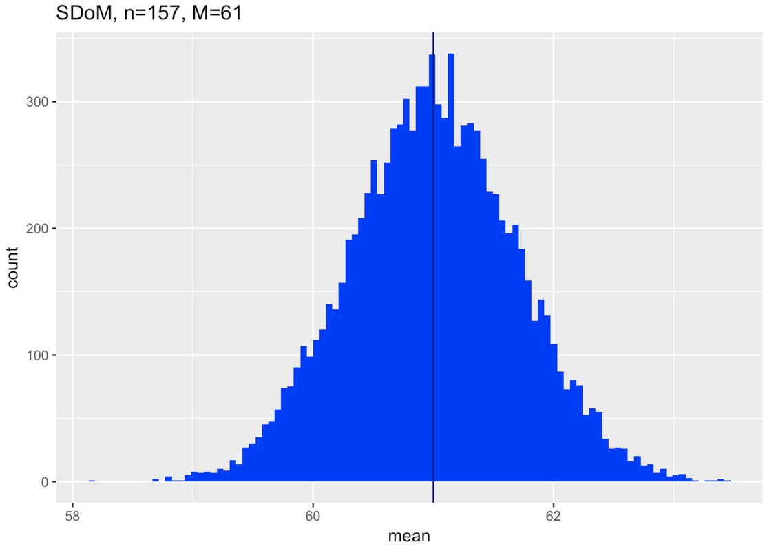
And finally, construct a sampling distribution with a mean of 61.
            require(tidyverse)
            require(mosaic)
            require(Lock5Data)
            require(supernova)

            RBackend::custom_seed(25)
            Thumb.stats <- favstats(~Thumb, data = Fingers)
            # change the population mean to 61
            SDoM <- do(1000) * mean(rnorm(157, mean = Thumb.stats$mean, sd = Thumb.stats$sd))

            # this creates a histogram of this SDoM
            gf_histogram(~mean, data = SDoM, bins = 100, fill = "blue") %>%
                gf_vline(xintercept = 61, color = "darkblue") %>%
                gf_labs(title = "SDoM, n=157, M=61")
            # change the population mean to 61
            SDoM <- do(1000) * mean(rnorm(157, 61, Thumb.stats$sd))

            # this creates a histogram of this SDoM
            gf_histogram(~mean, data = SDoM, bins = 100, fill = "blue") %>%
                gf_vline(xintercept = 61, color = "darkblue")%>%
                gf_labs(title = "SDoM, n=157, M=61")
ex() %>% check_object("SDoM") %>% check_equal()
The Key Idea: Try Imagining Different Sampling Distributions
Now you have what you need to understand how all of this works. We are going to reason like this:
If the population is normal, and…
If the standard deviation of the population is what we estimated from our sample (8.73)…
Then is it possible that our sample of 157 thumbs with a mean of 60.1 could have come from a population with a mean of… 65? 55? 61? These are the three means we tried, the ones that we used to construct the three hypothetical sampling distributions. Let’s look at them again with this question in mind.
Here’s the first sampling distribution we generated, with an assumed population mean of 65.
In the diagram below we have attempted to put all this together. The blue horizontal line provides a scale for thumb length in millimeters. Above the blue line we have plotted two of the sampling distributions we made. They both assume the population parameters we estimated based on our data (normal shape, \(\sigma\) of 8.73). The one on the left assumed a mean of 55, the one on the right, 65.
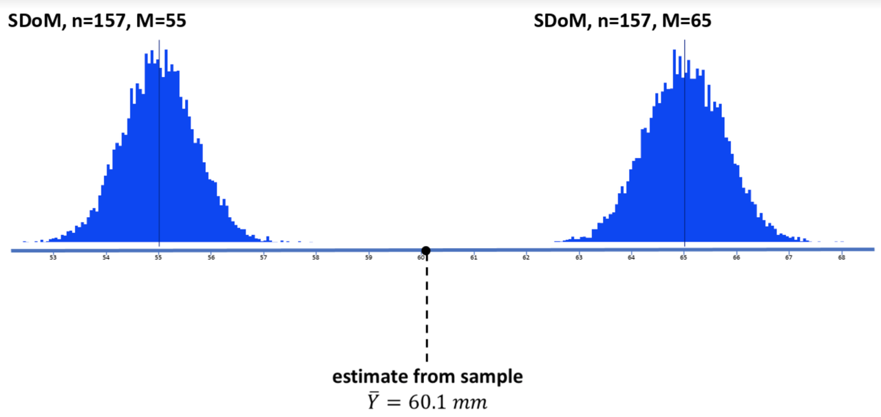
Below the blue line is the estimate of the population mean from our sample distribution, 60.1 (the black dot and dotted line). This is from our actual distribution of data.
It is clear from this picture that our sample is very unlikely to have come from a population with a true mean as low as 55 (see sampling distribution on left); it would come far to the right in the tail of the sampling distribution. Not impossible, but very unlikely.
The same is true for a population with a true mean as high as 65 (see sampling distribution on right). Again, it’s very unlikely.
But now, look below where we have added (in the middle) the sampling distribution assuming a population mean of 61. Could our observed sample have come from this distribution? Yes, it very well could have.
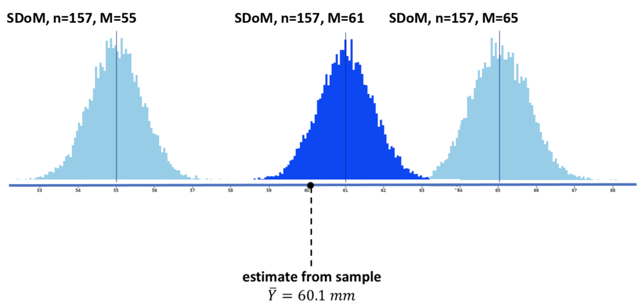
The key idea is this: by trying different sampling distributions, some higher, some lower, you can begin to see how accurate your estimate might be. We have estimated a mean of 60.1. But now we can see, by simulating sampling distributions, that our estimate is unlikely to be off by more than 5 mm.
It is highly unlikely that our sample could have come from a population with a true mean of 55 or lower, or from one with a true mean of 65 or higher. We can start to imagine doing this with all sorts of means (59? 59.5? 60.5? 62?). We can be more exact than this later, but for now: this is the logic you need to understand. Even though we don’t know the population, we can imagine one and then compare the various samples that it generates with the sample we actually collected. It’s probably the hardest but most powerful concept in this whole course. But we will keep coming back to this idea in many ways and you will eventually get it.
How Far Away Counts as Unlikely?
Now we have developed what is a really useful way of thinking about sampling distributions and why we need them. We use our sample data to hypothesize different populations. Then we use sampling distributions to help us figure out how accurate our estimates are, or how wrong they might be.
So far, we have used a kind of trial-and-error process for figuring this out. We can construct a set of sampling distributions assuming various means, and then look to see how Iikely our sample would be if the assumed population and sampling distribution were true.
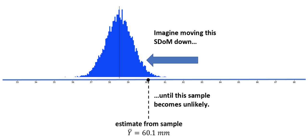
You can think, just like in the picture above, of sliding a sampling distribution to the left (toward lower means) until your observed sample mean is unlikely. You can also imagine sliding the sampling distribution right until your observed sample mean is unlikely. This would give you a sense of what the lower and upper bounds are that define where real population mean must be.
But how far to the left do we need to go to reach this “unlikely” point? And how far to the right?
Above, in the “Thinking Forward” section, we used the tally() command to see exactly what proportion of simulated samples was above or below some specific point in the distributions. What proportion, in the left or right tail, would make us say, “these samples are unlikely”?
Our discussion of the normal distribution back in Chapter 6 can help us here. We saw that the sampling distribution of means that we have been looking at are generally normal in shape. If it’s normal, then we know something about the probabilities under the curve.
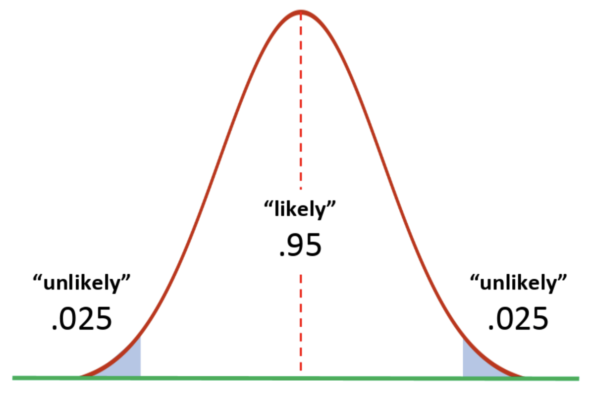
Statisticians, by convention, have agreed in general to call something with a lower than .05 probability of occurring unlikely. We need to slide our sampling distribution down until our sample just hits the unlikely region (shaded teal blue in the sampling distribution below). Our sample would be one of the upper .025 of simulated means generated this way.
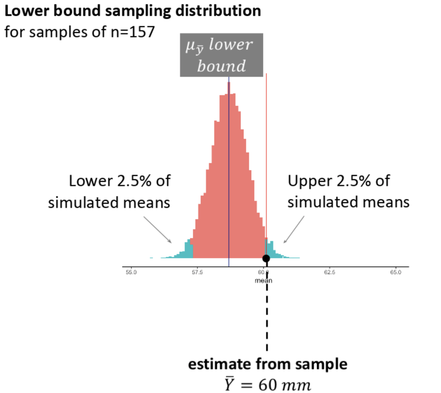
Let’s think about what it means for a sample to be in this teal blue area. This sampling distribution represents samples randomly generated from a population with a very low mean (we call it \(\mu_{\bar{Y}}\ lower\ bound\) in the picture). Our particular sample mean would be one of the higher means produced by this DGP. It would lie right at the boundary of what would be considered an “unlikely” sample to have come from this population.
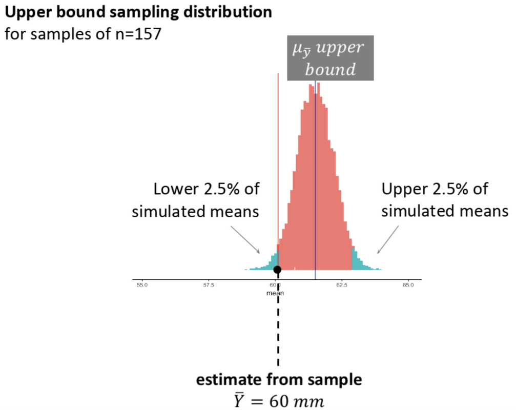
We also need to slide the sampling distribution up until our sample is one of the lower .025 of simulated means.
The key point here, which we will return to in the next chapter, is that if we want to maintain a .05 definition of unlikely, and we are using two extreme sampling distributions (one for the lower bound and another for the upper bound), then each of the unlikely zones will be defined by .025 of extreme random samples.
We can stack the lower and upper bound ideas together in the simulated histograms below. Here we have indicated our sample mean (60.1) in both histograms using the red vertical line. Then, we stacked the sampling distribution that illustrates the lower bound on top of the sampling distribution that illustrates the upper bound. Note that the shape and spread of the sampling distributions does not vary (only the mean does) as we move it to the left and to the right.
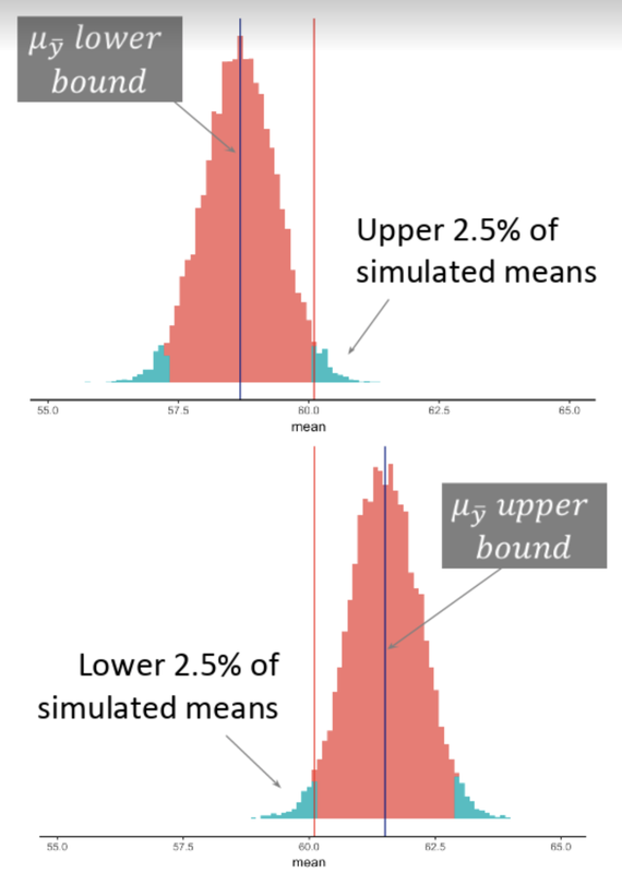
The histogram on the top is as low as we can go without making our observed sample mean “unlikely” to have come from this sampling distribution. The histogram on the bottom is the same, but is the highest we can go before we say, “No. Our sample is unlikely to have come from this sampling distribution.”
Here we will put the lower and upper sampling distributions together in one plot.
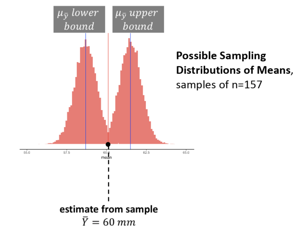
When sliding our sampling distributions up and down, we will find the upper and lower bounds that would define a range of populations where our sample would still be considered “likely”. Now remember what “likely” describes is something with a .95 probability of occurring, so this is the middle of the sampling distribution.
Using the figure above, we can see, then, that the range of populations where our sample would still be considered “likely” is probably between \(\mu\)s of 58.5 and 61.5. This is just based on our trial-and-error trying of different sampling distributions, and on a visual inspection of our histograms. Later we will see how to calculate this range more directly.