3.2 Visualizing Distributions With Histograms
Statistics provides us with a host of tools we can use for exploring distributions. Many of these tools are visual—e.g., histograms, boxplots, scatterplots, bar graphs, and so on. Being skilled at using these tools to look at distributions is an important part of the statistician’s toolbox—something you can take with you from this course!
Let’s start by looking at the distributions of some variables. Histograms are one of the most powerful tools we have for examining distributions.
The x-axis of a histogram represents values of the outcome variable. In the examples above we see (clockwise from upper left): the age of a sample of housekeepers measured in years; the thumb length of a sample of students measured in millimeters; the life expectancy of the citizens of countries measured in years; and the population of countries measured in millions.
One important thing to note about a histogram is that the y-axis represents either the frequency of some score or range of scores in a sample, or the proportion of a sample that had some score. So, in the first histogram (in the color coral), the height of the bars does not represent how old a housekeeper is, but instead represents the number of housekeepers in this sample who were within a certain age band.
There are lots of ways to make histograms in R. We will use the package ggformula to make our visualizations. ggformula is a weird name, but that’s what the authors of this package called it. Because of that, many of the ggformula commands are going to start with gf_; the g stands for the gg part and the f stands for the formula part. We will start by making a histogram with the gf_histogram() command.
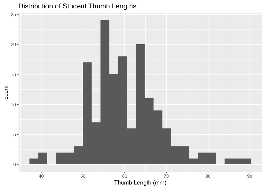
Here is how to make a basic histogram of Thumb length from the Fingers data frame.
gf_histogram(~ Thumb, data = Fingers)Try running it in R.
require(coursekata)
# try running this code
gf_histogram(~Thumb, data = Fingers)
gf_histogram(~Thumb, data = Fingers)
ex() %>% {
    check_function(., "gf_histogram") %>% check_arg("object", arg_not_specified_msg = "Make sure to keep ~Thumb") %>% check_equal()
    check_function(., "gf_histogram") %>% check_arg("data", arg_not_specified_msg = "Make sure to specify data") %>% check_equal()
    check_function(., "gf_histogram") %>% check_result() %>% check_equal(incorrect_msg = "For this exercise, make sure not to change the code")
}
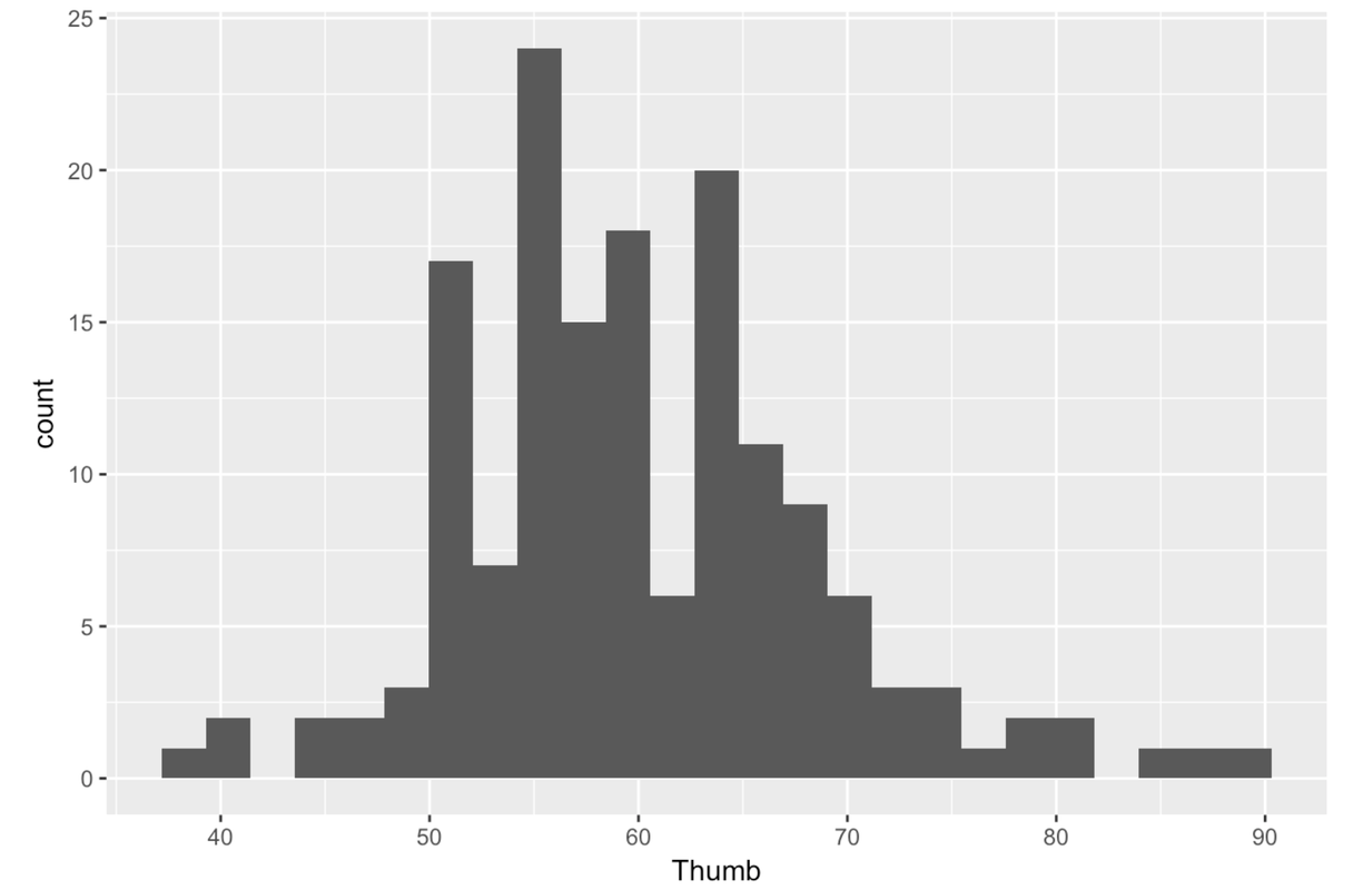
Notice that the outcome variable Thumb is placed after the ~ (tilde). Typically in R, whenever you put something before the ~, its values go on the y-axis and whenever you put something after the ~, its values go on the x-axis. A histogram is a special case where the y-axis is just a count related to the variable on the x-axis, not a different variable.
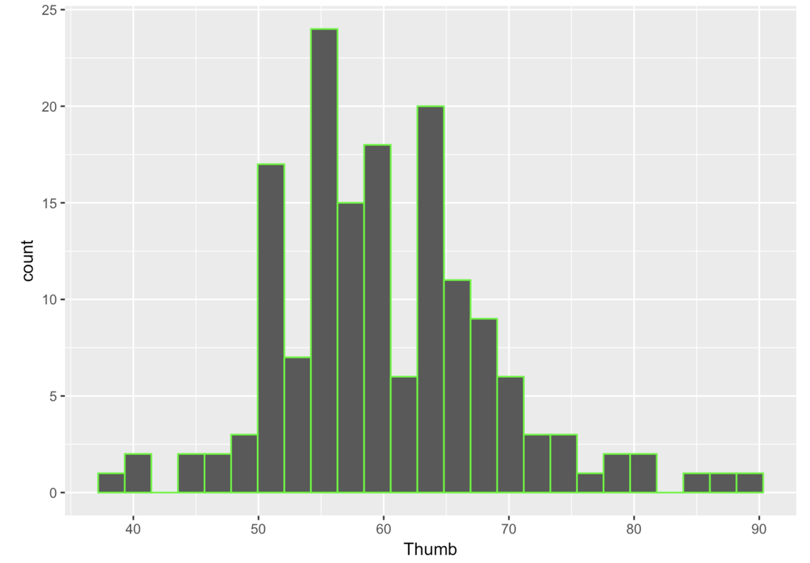
Even though this is not very important to statistics, it is fun to change the colors of your histogram. This is pretty easy to do. We can color the outline of the bars by adding in the option color and putting in the name of the color in quotation marks–e.g. “red”, “black”, “pink”, etc. Here you can download a list of R color terms (PDF, 214KB) available to you.
gf_histogram(~ Thumb, data = Fingers, color = "green")
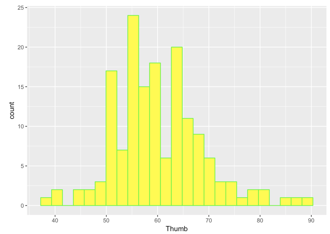
You can also fill in the bars with different colors using the option fill. Note, in R these options (e.g., color = or fill =) are called arguments because they are added into the function through the parentheses ().
gf_histogram(~ Thumb, data = Fingers, color = "green", fill = "yellow")
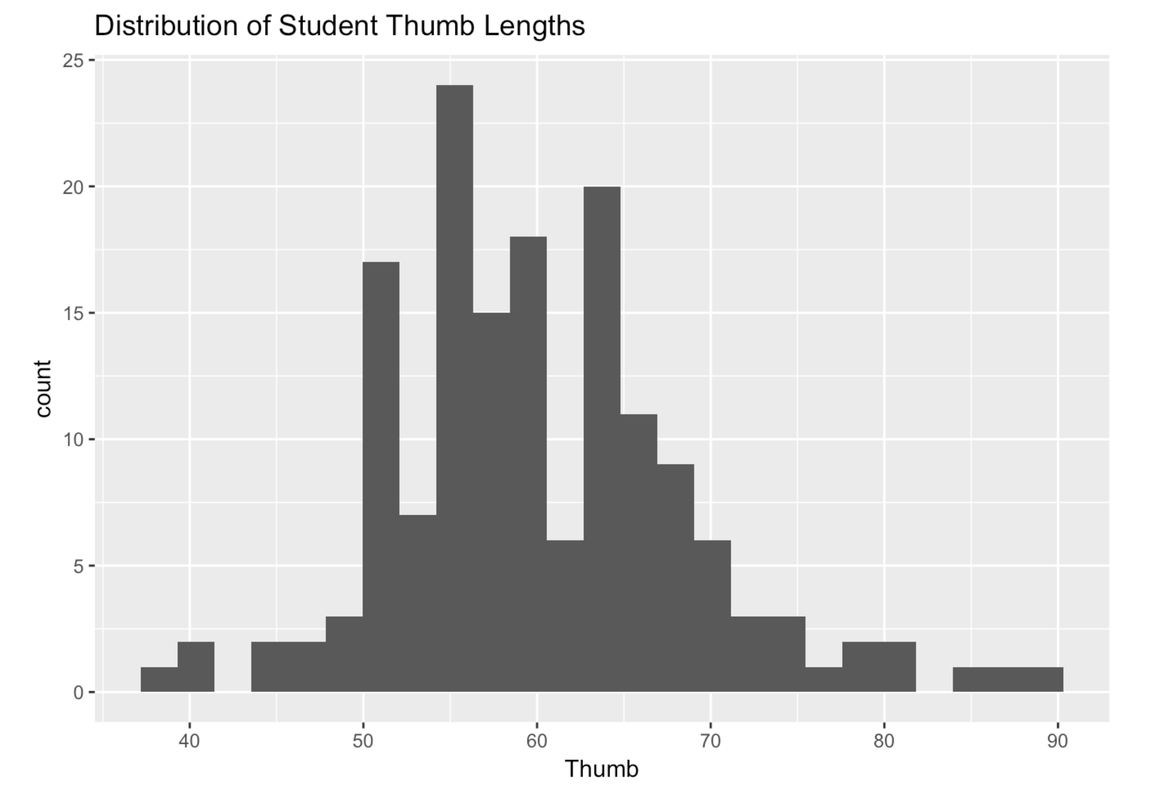
We can improve the histograms further by adding labels. For example, we can add a title. To do this we need to chain together multiple R functions: gf_histogram() and gf_labs() (which is the function that adds the labels). In R, we use the marker %>% at the end of a line to chain on a second command. Here’s the code that would add a title to a histogram.
gf_histogram(~ Thumb, data = Fingers) %>%
  gf_labs(title = "Distribution of Student Thumb Lengths")
Sometimes you may want to change the labels for the axes as well. For example, we might want to label the x-axis “Thumb Length (mm)” instead of just “Thumb”. (If you don’t specify a label, R just puts in the variable name, which is Thumb.) Here’s the R code for changing the label on the x-axis.
gf_histogram(~ Thumb, data = Fingers) %>%
  gf_labs(title = "Distribution of Student Thumb Lengths", x = "Thumb Length (mm)")
Now change the label for the y-axis (to whatever makes sense to you) by modifying the following code.
require(coursekata)
# Modify this code to play around with labeling the y-axis
gf_histogram(~ Thumb, data = Fingers) %>%
  gf_labs(x = "Thumb length (mm)", y = )
gf_histogram(~ Thumb, data = Fingers) %>%
  gf_labs(x = "Thumb length (mm)", y = "Your Label")
ex() %>% {
    check_function(., "gf_labs") %>% check_arg("x") %>% check_equal(eval = FALSE)
    check_function(., "gf_labs") %>% check_arg("y")
    check_function(., "gf_histogram") %>% check_arg("object") %>% check_equal()
    check_function(., "gf_histogram") %>% check_arg("data") %>% check_equal()
}Whenever you run across an R exercise, feel free to play around with these different options regarding color, fill, or labels. Make R work for you.
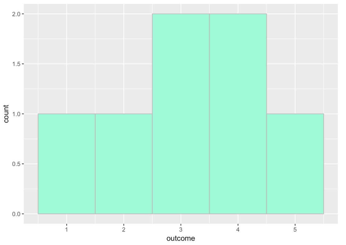
Because the variable on the x-axis is often measured on a continuous scale, the bars in the histograms usually represent a range of values, called bins. We’ll illustrate this idea of bins by creating a simple outcome variable called outcome.
outcome <- c(1, 2, 3, 4, 5)Here’s how to put this variable into a data frame (using the function data.frame()) and call the resulting data frame tiny_data:
tiny_data <- data.frame(outcome)Read the code below. Then, add some code to create a histogram of outcome. Try using the arguments color and fill. Feel free to pick any two colors you want.
require(coursekata)
# This sets up our tiny data frame with our outcome variable
outcome <- c(1, 2, 3, 4, 5)
tiny_data <- data.frame(outcome)

# Write code to create a histogram of outcome
outcome <- c(1, 2, 3, 4, 5)
tiny_data <- data.frame(outcome)
gf_histogram(~outcome, data = tiny_data, fill = "aquamarine", color = "gray")
ex() %>% {
    check_object(., "outcome", undefined_msg = "Make sure to not remove `outcome`") %>% check_equal()
    check_object(., "tiny_data") %>% check_column("outcome") %>% check_equal(incorrect_msg = "Make sure to not alter `tiny_data`")
    check_function(., "gf_histogram") %>% {
        check_arg(., "fill", arg_not_specified_msg = "Remember to use `fill =` with your own choice of color")
        check_arg(., "color", arg_not_specified_msg = "Remember to use `color =` with your own choice of color")
    }

    check_or(.,
        check_function(., "gf_histogram") %>% {
            check_arg(., "object") %>% check_equal(eval = FALSE, incorrect_msg = "Make sure you specify `~outcome` as the first argument.")
            check_arg(., "data") %>% check_equal(incorrect_msg = "Did you set `data = tiny_data`?")
        },
        override_solution_code(., '{
            outcome <- c(1, 2, 3, 4, 5)
            tiny_data <- data.frame(outcome)
            gf_histogram(~tiny_data, fill = "aquamarine", color = "gray")
        }') %>%
            check_function("gf_histogram") %>%
                check_arg("object") %>%
                check_equal(eval = FALSE)
    )

}
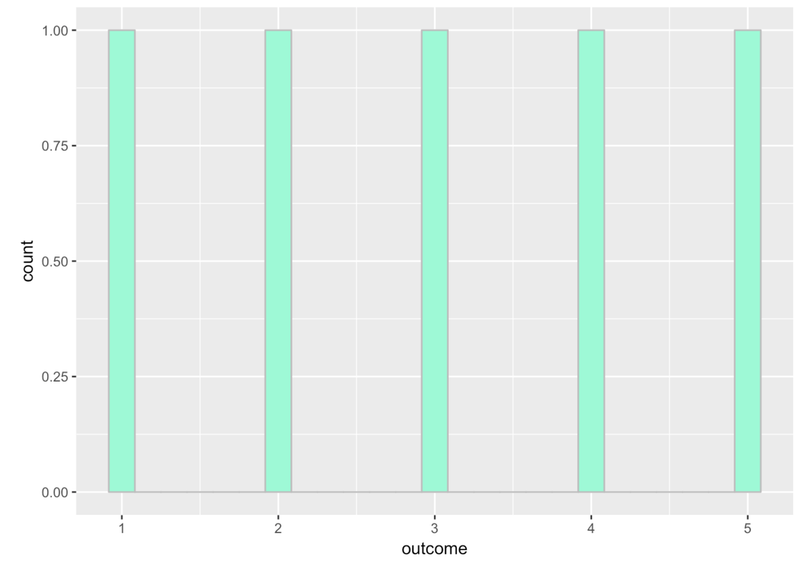
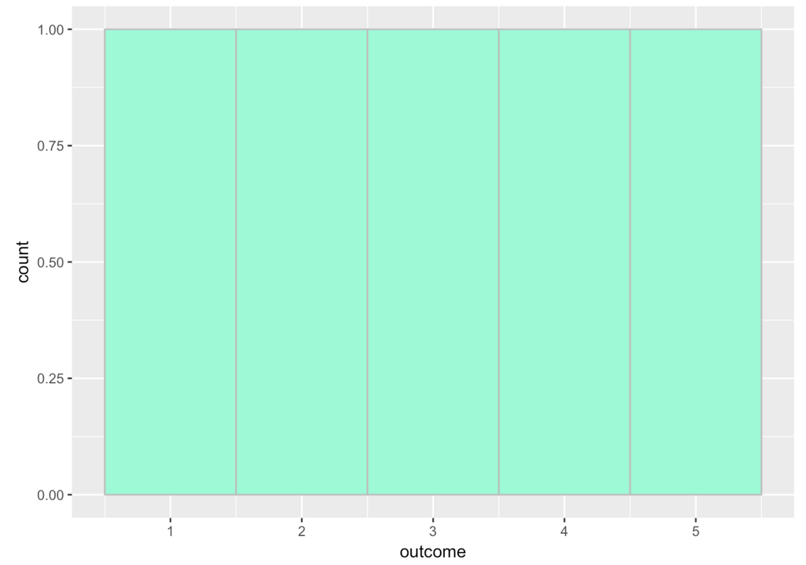
This histogram shows gaps between the bars because by default gf_histogram() sets up 30 bins, even though we only have five possible numbers in our variable. If we change the number of bins to 5, then we’ll get rid of the gaps between the bars. Like this:
gf_histogram(~ outcome, data = tiny_data, fill = "aquamarine", color = "gray", bins = 5)
Try running the following code.
require(coursekata)
# This is the same code as before but we added in another outcome value, 3.2
outcome <- c(1, 2, 3, 4, 5, 3.2)
tiny_data <- data.frame(outcome)

# This makes a histogram with 5 bins
gf_histogram(~ outcome, data = tiny_data, fill = "aquamarine", color = "gray", bins = 5)
outcome <- c(1, 2, 3, 4, 5, 3.2)
tiny_data <- data.frame(outcome)
gf_histogram(~ outcome, data = tiny_data, fill = "aquamarine", color = "gray", bins = 5)
ex() %>% check_object("outcome", undefined_msg = "Make sure not to delete 'outcome'") %>% check_equal(incorrect_msg = "Make sure not to change the content of 'outcome'")
ex() %>% check_object("tiny_data", undefined_msg = "Make sure not to delete 'tiny_data'") %>% check_equal()
ex() %>% check_function("gf_histogram") %>% {
    check_arg(., "object") %>% check_equal()
    check_arg(., "data") %>% check_equal()
}
success_msg("You're doing great!")
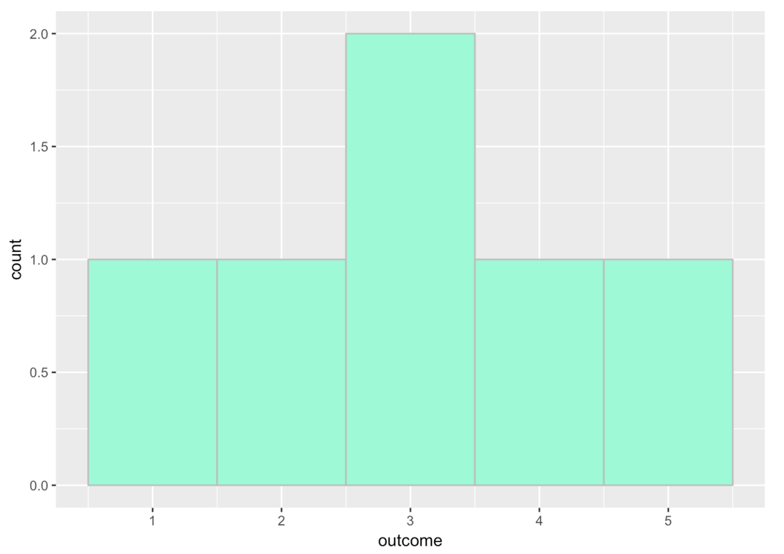
If you look closely at the x-axis, you’ll see that the bin for 3 actually goes from 2.5 to 3.5.
Add the number 3.7 to our outcome values. Run the code to see what the histogram would look like then.
require(coursekata)
# add 3.7 to the outcome values, then run this code
outcome <- c(1, 2, 3, 4, 5, 3.2)
tiny_data <- data.frame(outcome)

# this makes a histogram with 5 bins
gf_histogram(~ outcome, data = tiny_data, fill = "aquamarine", color = "gray", bins = 5)
# add 3.7 to the outcome values, then run this code
outcome <- c(1, 2, 3, 4, 5, 3.2, 3.7)
tiny_data <- data.frame(outcome)

# this makes a histogram with 5 bins
gf_histogram(~ outcome, data = tiny_data, fill = "aquamarine", color = "gray", bins = 5)
inc_msg = "Don't alter the other code in this exercise -- only the contents of `outcome`."
ex() %>% {
    check_object(., "outcome") %>% check_equal(incorrect_msg = "Did you add 3.7 to the outcome vector?")
    check_object(., "tiny_data") %>% check_equal(incorrect_msg = inc_msg)
    check_function(., "gf_histogram")
}
The 3.7 was added to the 4th bin, which seems to go from 3.5 to 4.5.
You can also adjust the binwidth, or how big the bin is. We can add in binwidth (like bins) as an argument. Here’s an example:
gf_histogram(~ outcome, data = tiny_data, fill = "aquamarine", color = "gray", binwidth = 4)
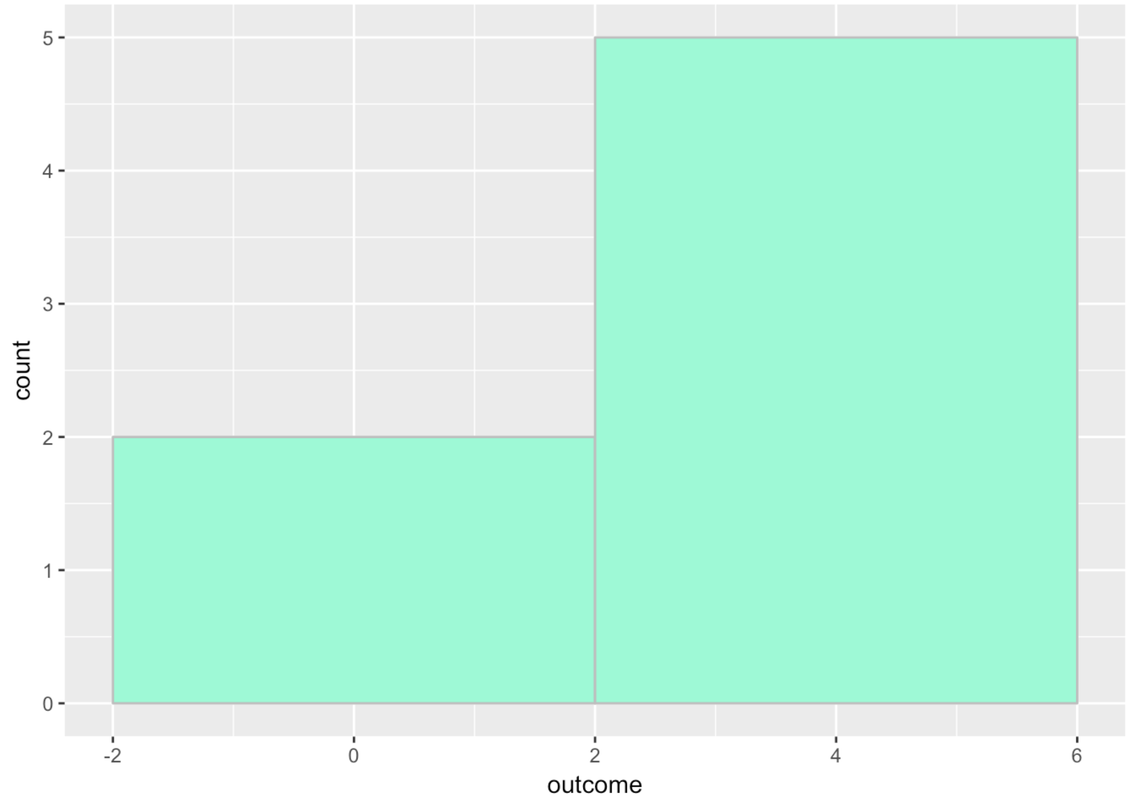
There are two columns because each bin has a width of 4. The first bin goes from -2 to 2 and there are only two numbers that go in that bin from our tiny set of outcomes. All the other numbers go in the bin from 2 to 6.
You may have been surprised to see the x-axis go from -2 to +6. After all, none of our numbers were negative. R did this because we put it in a difficult position. It had to include numbers as high as 5, and we required it to have a binwidth of 4. Not all of the numbers could fit within a single bin of width 4, so R had to make two bins. R just does its best to follow your commands!
We can use arrange() to sort our outcome values to take a closer look at them.
arrange(tiny_data, outcome) outcome
1 1.0
2 2.0
3 3.0
4 3.2
5 3.7
6 4.0
7 5.0It is important to note that adjusting the number and width of bins will often change the pattern you see in a variable. So, it’s good to experiment with different settings.
Modify the code below to generate histograms of Thumb with different numbers of bins and bin widths.
require(coursekata)
# adjust the number of bins to 50
gf_histogram(~ Thumb, data = Fingers, bins = )

# adjust the number of bins to 5
gf_histogram(~ Thumb, data = Fingers)

# adjust the bin width to 3
gf_histogram(~ Thumb, data = Fingers, binwidth = )

# adjust the bin width to 10
gf_histogram(~ Thumb, data = Fingers)
# adjust the number of bins to 50
gf_histogram(~ Thumb, data = Fingers, bins = 50)

# adjust the number of bins to 5
gf_histogram(~ Thumb, data = Fingers, bins = 5)

# adjust the bin width to 3
gf_histogram(~ Thumb, data = Fingers, binwidth = 3)

# adjust the bin width to 10
gf_histogram(~ Thumb, data = Fingers, binwidth = 10)
ex() %>% {
    check_function(., "gf_histogram", index = 1) %>% check_arg("bins") %>% check_equal(incorrect_msg = "Did you set the number of `bins` to 50?")
    check_function(., "gf_histogram", index = 2) %>% check_arg("bins", arg_not_specified_msg = "Did you set the number of `bins` to 5?") %>% check_equal(incorrect_msg = "Did you set the number of `bins` to 5?")
    check_function(., "gf_histogram", index = 3) %>% check_arg("binwidth") %>% check_equal(incorrect_msg = "Did you set the `binwidth` to 3?")
    check_function(., "gf_histogram", index = 4) %>% check_arg("binwidth", arg_not_specified_msg = "Did you set the `binwidth` to 10?") %>% check_equal(incorrect_msg = "Did you set the `binwidth` to 10?")
}Histograms and Density Plots
Relative frequency histograms represent proportion instead of frequency of cases on the y-axis. So, in the histogram of our tiny_data numbers above, instead of showing two numbers in the bin from -2 to 2, and five in the bin from 2 to 6, it would show .286 of numbers (or 2 out of 7) in the first bin, and .714 (or 5 out of 7) in the second bin.
Relative frequency histograms are useful because they allow you to more easily compare distributions across samples of different sizes. In R, it is easier to use a measure called density instead of proportion, and density works better for continuous variables. It’s not exactly the same as a proportion, but it’s close enough. It will still range from 0.0 to 1.0, and the interpretation is similar.
To create density histograms instead of frequency histograms, use a slightly modified function, gf_dhistogram(), such as in the DataCamp window below. Run the code below to create a density histogram of the Age variable from MindsetMatters. Then add the code to produce a basic frequency histogram of the same variable.
require(coursekata)
# This will create a relative frequency histogram of Age
gf_dhistogram(~ Age, data = MindsetMatters, fill = "coral2")

# Add code below to create a frequency histogram of Age
gf_dhistogram(~ Age, data = MindsetMatters, fill = "coral2", bins = 20)
gf_histogram(~ Age, data = MindsetMatters)
ex() %>% check_function(., "gf_histogram") %>% {
    check_arg(., "object") %>% check_equal()
    check_arg(., "data") %>% check_equal()
}Note that you may get a warning when you run these histograms. We got this:
Warning message: Removed 1 rows containing non-finite values (stat_bin)Don’t worry about it. It’s because there was a missing data point in this data frame.
As you can see, the shapes of the two histograms look identical. This makes sense, because the same data points are being plotted with the same bins. The only thing different is the scale of measurement on the y-axis. On the left it is density (think proportion of housekeepers); on the right, frequency (or number of housekeepers).
Notice that in this case the density histogram looks basically the same as the frequency histogram. Density will become more important to us as we start to compare multiple groups, so it’s good to get in the habit of making density plots now.